Joy Foroughi
Executive Assistant


Aligning App Branding and UX for a Consistent User Experience
Discover how aligning app branding with UX enhances user trust and experience. Elevate your brand’s impact with these actionable steps.
App branding and UX alignment means every visual, verbal, and behavioral signal in your product reinforces the same brand attributes your users encounter on your marketing site. The single highest-leverage move you can make this sprint is picking one brand attribute (say, "trustworthy" or "fast") and mapping it to one core flow with a concrete design token. Do that before you touch color palettes or icon sets.
Here's a three-step starter your team can run in a single week:
Pick one attribute. Choose the brand trait most at risk of getting lost in your UI (often "trustworthy," "playful," or "efficient").
Map it to one flow. Identify the screen or interaction where that trait matters most (checkout, onboarding, error recovery).
Encode it as a token. Translate the attribute into a named design token, motion rule, or microcopy pattern engineering can actually implement.
Quick wins while you're at it:
Audit your empty and error states. They're where brand voice usually disappears first.
Check whether your accent color shows up on navigation chrome (it shouldn't) or in content moments (it should).
Ask one developer to name three brand attributes from memory. If they can't, your design system isn't documenting them.
Pro Tip: Run a five-minute "squint test" on your highest-traffic screen. Blur your eyes until only shapes and color blocks remain. If nothing reads as distinctly "your brand," the alignment work needs to start at the token layer, not the pixel layer.
Key Takeaways
Aligning app branding and UX requires mapping brand attributes to specific interaction patterns, encoding them as design tokens, and validating the result with real user testing.
Point | Details |
|---|---|
Start with attributes, not colors | Translate brand attributes into behavior before touching visual design to avoid rework later. |
Use semantic tokens | Name tokens by intent ( |
Respect platform layers | Keep brand color in the content layer and native components in the stable UI layer. |
Validate with users | Combine task-completion metrics with perception surveys to catch gaps behavioral data misses. |
Work with a senior, cross-functional team | TouchZen aligns brand strategy, design systems, and engineering from kickoff to launch and post-launch support. |
What Does Branding in UX Mean for Apps?
Branding in UX is not a logo slapped onto a splash screen. It's the sum of visual choices (color, type, iconography), verbal choices (microcopy, error messages, onboarding language), and behavioral choices (motion timing, interaction feedback, how a control responds to a tap) that together tell a user who you are while they're trying to get something done. Traditional brand work optimizes for recognition in a static ad or a five-second glance. App branding has to survive hundreds of micro-interactions a day, most of which have nothing to do with looking pretty and everything to do with whether a button feels trustworthy enough to tap.
Nielsen Norman Group frames this shift plainly: interaction and user experience have become primary carriers of brand perception, often outweighing traditional marketing touchpoints. When your UX contradicts your brand promise, the promise breaks, not the UX. A bank that markets itself as "effortless" but buries account settings four taps deep isn't just delivering bad UX. It's lying to its own customers, one tap at a time.
The business case is not abstract. Time spent inside apps now dominates how people experience digital brands day to day, which means your app is frequently the only brand touchpoint a user has. There's no separate "brand moment" happening elsewhere to compensate for a confusing flow.
Misalignment shows up in familiar ways your team has probably already lived through:
A fintech app with a "friendly, human" brand voice that greets a failed transaction with a raw error code.
A wellness app promising "calm" that uses jarring, high-contrast alerts for routine notifications.
A premium retail app whose onboarding feels like a free trial dark pattern, undercutting every "we value you" headline on the website.
Each of these is a UX decision made in isolation from brand strategy. Alone, none of them tanks a product. Stacked across a dozen screens, they quietly convince users your brand promise was marketing copy, not a real commitment.
Core Principles for Aligning Brand and UX in Mobile Apps
Alignment isn't a mood board exercise. It's a set of decision rules your team applies every time a designer opens Figma or an engineer starts a ticket. Five principles do most of the work:
Design systems first, screens second. Build the token layer and component library before you design individual flows, so brand decisions get made once instead of re-litigated on every screen.
Respect platform conventions. Apple's Human Interface Guidelines and Android's Material Design guidance exist because users have learned specific gestures and layouts. Fighting them in the name of "brand distinctiveness" usually costs more in confusion than it gains in recognition.
Clarity beats novelty at decision points. If a custom control and a native one perform the same job with equal legibility, use the native one. Reserve custom treatments for moments where brand expression actually adds value, like a celebratory animation after a milestone.
Accessibility is a brand requirement, not a compliance checkbox. A brand that claims to be "for everyone" but fails WCAG contrast minimums is making a claim its own product contradicts.
Brand cues are behavioral before they're decorative. How fast something animates, how a control responds to error, how forgiving an input field is, these carry more brand signal over time than a color swatch does.
The hardest calls happen at the boundary between principle three and four: when should you customize a native control? A useful rule of thumb is to customize only when the native option genuinely fails to communicate something your brand promise depends on, and never customize purely for visual differentiation. A native iOS switch that toggles a setting doesn't need brand treatment. A progress indicator during a multi-step onboarding that's supposed to feel "guided and reassuring" might.
Error and empty states deserve special attention because they're the moments users remember longest. A generic "Something went wrong" contradicts a brand voice built on warmth or expertise. Rewriting these states in your actual brand voice, with the same care given to your landing page copy, is one of the cheapest alignment wins available.
Pro Tip: Build your accessibility contrast checks directly into your color tokens rather than auditing after the fact. A token like --color-primary-accessible that's pre-validated against WCAG AA saves your team from discovering contrast failures during QA, when fixing them means reworking shipped screens. For deeper accessibility grounding, TouchZen's guide on designing for accessibility in mobile apps walks through practical contrast and typography standards.
What Is the Process for Aligning Brand and UX?
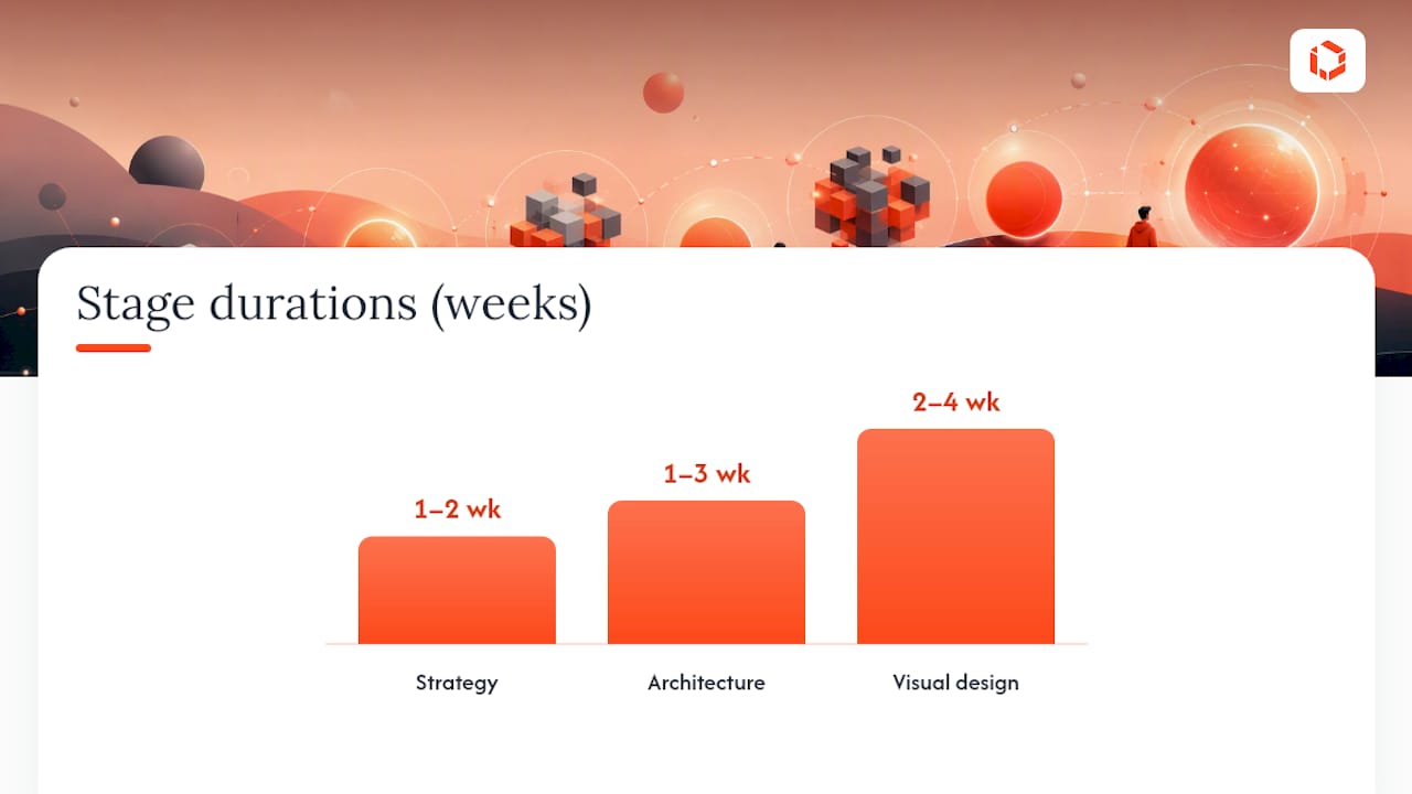
Alignment breaks down into four stages, each producing a specific artifact the next stage depends on. Skipping a stage doesn't save time, it just moves the rework further downstream where it's more expensive to fix. Smashing Magazine's guide to mobile app design makes this point directly: architecture failures, not visual ones, are the leading cause of late-stage rework and early retention loss.
Strategy (1 to 2 weeks). Define three to five brand attributes in behavioral terms (not adjectives on a slide, but "responds within 200ms" or "confirms every destructive action twice"). Output: a brand-attribute brief every designer and engineer can reference.
Architecture (1 to 3 weeks depending on app complexity). Map user flows before screens. Decide where brand expression belongs in the information architecture, not just the visual layer. Output: flow diagrams annotated with brand-attribute checkpoints.
Visual design (2 to 4 weeks). Translate the brief into components, tokens, and a documented component library. Output: a Figma-based design system with named tokens, not just a style guide PDF.
Handoff and governance (ongoing). Establish who approves new components, how tokens get versioned, and what triggers a brand-alignment review. Output: a living governance doc and a change-review ritual.
Most teams underestimate stage two and overinvest in stage three. A gorgeous component library built on a poorly mapped flow just produces beautiful confusion.
Decision Area | Product Manager | Brand Lead | UX/UI Designer | Engineering |
|---|---|---|---|---|
Brand attribute definitions | Approves final list | Owns and drafts | Consults on feasibility | Reviews for technical implications |
Flow architecture | Prioritizes flows by business impact | Consults on brand touchpoints | Owns and drafts | Flags technical constraints early |
Token naming and values | Approves scope | Owns semantic meaning | Owns implementation in Figma | Owns implementation in code |
Component behavior rules | Consults | Reviews for voice/tone fit | Owns and drafts | Owns final behavior in build |
Governance and change review | Chairs review cadence | Vetoes brand-breaking changes | Proposes updates | Flags technical debt from drift |
The pattern worth noticing: nobody owns everything, and that's the point. Brand drift happens fastest when one function assumes another has already handled it. TouchZen's UX and UI design services build this cross-functional ownership into the process from kickoff, rather than treating it as a documentation exercise added after design is "done." For teams still working out their information architecture, our guide to UI design fundamentals covers the component-structure decisions that stage three depends on.
How Do Design Tokens Encode Brand Behavior?
Tokens are the mechanism that turns a brand attribute into something engineering can actually build, rather than a PDF nobody opens after kickoff. A color token like --color-primary tells you nothing about intent. A semantic token like --color-trust-border tells a developer exactly when and why to use it, even if they've never read your brand brief.
Your token system needs at least three layers to carry brand behavior, not just brand aesthetics:
Token Layer | Example | What It Encodes |
|---|---|---|
Primitive tokens |
| Raw values with no meaning attached |
Semantic tokens |
| Intent tied to a UI role or brand attribute |
Component tokens |
| Specific application inside a component |
UXMagic's mobile app design framework recommends exactly this layered approach, arguing that semantic naming prevents the kind of design drift that happens when someone swaps a color value without understanding what it was communicating. A raw hex code gets reused wherever it's convenient. A token named --color-trust-border only gets reused where trust is actually the message.
Motion and voice need the same treatment, and this is where most design systems fall short. Documenting an easing curve as ease-in-out, 300ms tells engineering how something moves but not why. A brand behavior note like "warm easing: soft deceleration, no bounce, used for confirmations that should feel reassuring rather than celebratory" gives that same curve a reason to exist and a rule for when to reuse it. Voice tokens work similarly: instead of a style guide sentence like "be friendly," write specific rules such as "error messages name the problem in one clause, then offer the fix in the next, never apologize twice."
A short pattern for a component token in practice:
None of this needs to be complicated engineering. It needs to be named clearly enough that a developer three months into the project, who never sat in a brand workshop, still makes the right call by default.
Pro Tip: Freeze your token names before your first public launch, even if the values underneath change later. Renaming tokens after engineering has wired them into components creates a silent rework tax that shows up as inconsistent screens six months later, right when your team has the least bandwidth to fix it. TouchZen's breakdown of 2026 UI trends for startups has more on building component libraries that scale without constant renaming.
How Should Brand Show Up in Color, Type, Icons, and Motion?
The single most common mistake is treating every pixel as brand real estate. Apple's WWDC 2026 guidance draws a sharper line: treat the app as two layers, a stable UI layer for navigation and controls, and a content layer that's the right place for brand expression. Your accent color belongs in the content layer, not stamped across every button and nav icon.
Color:
Do reserve your signature accent for moments that matter (a completed purchase, a key call-to-action, a milestone celebration).
Don't apply brand color to every interactive element. If everything is the accent color, nothing is.
Do use neutral, native-feeling colors for chrome, tab bars, and system controls.
Typography:
Do use system fonts (SF Pro, Roboto) for body text and functional UI to preserve legibility and support dynamic type accessibility settings.
Don't force a custom display font into small UI labels where it sacrifices readability for recognition.
Do reserve custom typography for headlines, empty states, or onboarding, where identity matters more than density of information.
Iconography and motion:
Do use platform-standard icon sets like Apple's SF Symbols or Material Symbols as your baseline, customizing only the handful that carry unique brand meaning.
Don't redesign every icon in a custom style purely for consistency with your logo. Users recognize a settings gear faster than a bespoke glyph.
Do use motion timing and easing as a brand signal (snappy and linear for "efficient" brands, soft and eased for "calm" or "warm" ones).
Microcopy:
Do write error and empty states in the same voice as your marketing copy, adjusted for brevity.
Don't default to generic system copy ("Error: 404") when your brand voice promises something more human.
Pro Tip: Look at Slack for a masterclass in restraint: its purple only appears in specific brand moments, while the vast majority of the interface stays neutral and functional. Compare that to NYT Cooking, where the brand voice lives almost entirely in content, photography, and recipe copy rather than UI chrome. Both prove the same point: brand color and voice work harder when they're rationed.
How Should Product, Design, Brand, and Engineering Collaborate?
Alignment fails organizationally more often than it fails creatively. UXMatters identifies siloed teams and misaligned incentives as leading causes of inconsistent brand experiences, and that matches what shows up in most rework tickets: a designer didn't know a token existed, or a brand team signed off on a color nobody told engineering how to implement.
Fixing this takes rituals, not just tools:
A brand-in-UX kickoff workshop. Get brand, product, design, and one engineer in the same room before architecture starts, not after visual design ships.
A recurring design critique that includes brand. Weekly or biweekly critiques should evaluate screens against brand attributes, not just usability heuristics.
A token review cadence. Before any new token ships, someone from brand and someone from engineering both sign off.
A pre-handoff checklist designers run before sending screens to development: Does every color map to a named token? Does copy match documented voice rules? Do error states carry the same tone as happy paths?
Shared tooling matters as much as the meetings. A single Figma library that both brand and product design pull from, a versioned token manager rather than a static PDF, and a component catalog that shows both the visual spec and the behavioral rule (not just how it looks, but when to use it) all reduce the number of times someone reinvents a decision that was already made. The Interactive Studio's guidance on aligning brand with digital product experience makes a similar case: co-creating brand and UX in the same sessions, rather than handing brand a finished UX for approval, is what prevents the "identity whiplash" users feel when marketing and product read like two different companies.
How Do You Measure Whether Brand and UX Are Aligned?
You can't manage what you don't measure, and brand alignment is measurable on both behavioral and perceptual axes.
Behavioral metrics tell you whether alignment is helping or hurting task performance:
Task completion rate on flows where you introduced new brand-driven interaction patterns.
Drop-off rate at error and empty states before and after a voice rewrite.
Time-to-first-action in onboarding, comparing brand-heavy versus stripped-down variants in an A/B test.
Perception metrics tell you whether users actually feel what you intended:
Post-task survey questions like "This app feels [trustworthy/efficient/warm]" on a 5-point scale, tracked over time.
Net Promoter Score segmented by users who completed brand-critical flows versus those who didn't.
A structured UX identity scale, the kind of method Springer's research on aligning brand management and user experience describes, which maps brand values to specific psychological needs and validates whether the interaction patterns you designed actually communicate the attributes you intended.
Qualitative validation rounds this out. Moderated user tests focused specifically on brand attribute perception, asking participants to describe the app's "personality" in their own words before you show them your brand brief, often surface gaps a quantitative survey misses entirely.
Combine both. A flow can score well on task completion while still feeling cold or generic to users. That gap between behavioral success and perceptual mismatch is exactly where alignment work pays off. TouchZen's guide on improving app user experience for startups has more on structuring these measurement loops for early-stage teams.
What Mistakes Break Brand and UX Alignment?
Four mistakes account for most of the drift teams experience:
Treating brand as wallpaper. Applying colors, fonts, and logos after the UX is finished, rather than designing interaction patterns from brand attributes.
Skipping architecture. Jumping straight to visual design without mapping flows first, which guarantees rework once real user paths reveal gaps.
Inconsistent token use. Letting engineers hardcode hex values or spacing instead of pulling from named tokens, which quietly reintroduces drift screen by screen.
Ignoring accessibility until QA. Retrofitting contrast and type-size fixes late in the process, which often conflicts with brand color choices made earlier without accessibility in mind.
A short review checklist to run every sprint: Does this screen use only documented tokens? Does copy match the brand voice guide, including error states? Would this screen pass a contrast check without special pleading? Does this flow match the architecture map, or did it drift during implementation?
Remediation is usually cheaper than teams expect if caught early: rename a hardcoded value into a token, rewrite one error string, add one contrast-safe variant. Left for six months, the same fixes require a design system audit.
What Do Real Alignment Wins Look Like?
Moving brand color out of navigation and into content. One team had wrapped their signature orange around every tab bar icon and nav element, following Apple's two-layer guidance, they moved it to content only: completed-order confirmations, milestone badges, key CTAs. Navigation became neutral and native-feeling. Users reported the app felt "calmer" while brand recognition in usability tests stayed unchanged, because the accent now appeared at moments people actually remembered.
Rewriting onboarding to match the brand promise. An app marketed as "the simple way to invest" opened onboarding with six screens of legal disclosures before a single friendly sentence. Reordering to lead with a one-line reassurance, then layering disclosures contextually where relevant, cut onboarding drop-off without changing a single legal requirement.
Standardizing error voice across the app. A wellness brand promising "calm" had inconsistent error copy, some technical, some overly casual. Writing one documented voice rule (name the problem, offer the fix, no exclamation points) and applying it everywhere took a few days and eliminated the jarring tonal shifts users had flagged in support tickets.
Each example works for the same reason: it changed a behavioral or structural decision, not just a color swatch.
How TouchZen Aligned Brand and UX for a Consumer App Client
A consumer-facing startup came to TouchZen with a brand identity built for its marketing site, bold color, confident typography, but a product experience that felt generic and interchangeable with competitors. The objective was straightforward: make the app itself recognizably theirs without sacrificing usability on either iOS or Android.
TouchZen's senior team ran the brand attributes (described by the client as "confident," "fast," and "no-nonsense") through the architecture stage first, mapping each attribute to specific interaction patterns before touching visual design:
"Confident" became decisive motion timing, no hesitant fade-ins, and direct microcopy with no hedging language ("Save changes" instead of "Would you like to save?").
"Fast" became skeleton-loading states instead of spinners, and a token rule capping animation duration at 200ms across the app.
"No-nonsense" became flattened navigation (fewer taps to core actions) and error states that named the problem in plain language.
Every attribute was translated into a named token or documented behavior rule before handoff, so engineering could implement without re-interpreting brand intent screen by screen.
The top lesson from the engagement: mapping attributes to tokens before visual design started saved multiple rounds of rework that would have otherwise happened after the design system was already built.
A Practical Perspective on Where Teams Get Alignment Wrong
Most teams treat brand and UX alignment as a design problem when it's really a naming problem. The moment you name a token --color-trust-border instead of --blue-2, you've forced every future decision through the lens of intent, not aesthetics. That single habit prevents more drift than any amount of design review.
If there's one action to start next sprint, it's this: audit your existing color and spacing values, and rename the five most-used ones with semantic, intent-based names. You'll immediately see which brand attributes have no token representation at all, and that gap is exactly where alignment work should start.
How TouchZen Helps You Align Brand and UX From Day One
TouchZen builds app brand and UX alignment into the engagement from kickoff, not as a separate workstream bolted on after design is finished. That means brand strategy, design-system architecture, and engineering handoff happen with the same senior team involved end to end, so a token defined in week two still means the same thing when it ships in week ten. Startups working with TouchZen skip the common failure mode where an agency hands off a beautiful comp deck that engineering has to reinterpret from scratch.
If your app's brand feels disconnected from how it actually behaves, TouchZen's mobile app development team can map your brand attributes to a working design system and ship it with the same senior developers and designers from strategy through launch and post-launch support. Teams building an MVP can also start lean with TouchZen's MVP development service to get brand and UX right before scaling engineering spend. Reach out through TouchZen's team page to walk through your current app or brand brief and get a straight answer on what alignment work would take.
Sources
WWDC 2026: Design session on app branding and platform layers
Comprehensive guide to mobile app design — Smashing Magazine
FAQ
What Is App Branding and UX Alignment?
It's the practice of making an app's visual, verbal, and behavioral design consistently express the same brand attributes as its marketing, using tools like design tokens and documented component rules so engineering can implement brand intent reliably.
Why Does Branding Matter in UX Design?
Interaction and user experience have become primary carriers of brand perception, so a confusing or inconsistent app UX actively undermines whatever promise a brand makes elsewhere.
How Long Does Brand and UX Alignment Take?
A typical process runs four to nine weeks across strategy, architecture, and visual design stages, with governance and token review continuing as an ongoing ritual after launch.
Should I Use Native Components or Custom Brand Elements?
Default to native platform components like Material or SF Symbols for navigation and common controls, reserving custom brand treatments for content moments where they add real recognition value without confusing users.
Can an Agency Help With Brand and UX Alignment?
Yes. TouchZen builds brand-aware design systems, tokens, and component libraries directly into its app development engagements, with a senior team handling strategy through engineering handoff and post-launch support.