
Joy Foroughi
Executive Assistant


8 Warning Signs Your Mobile App Needs a Redesign
Discover the 8 key signs that indicate your mobile app needs a redesign. Optimize user experience and boost retention with data-driven insights.

Whether your app needs a redesign comes down to eight measurable warning signs: declining retention, falling conversion, rising crash rate, stale UI/UX, poor app-store ratings, a growth plateau despite ad spend, feature bloat with ignored functionality, and compatibility or security gaps. Before approving a single design dollar, check your data first. Pull your retention cohorts in Amplitude or Mixpanel, review crash-free user rates in Google Firebase Crashlytics, and scan your last 90 days of support tickets. The evidence is already there. Your first move is a combined UX and analytics health check, which takes one to two days and tells you whether you're facing a cosmetic problem or a structural one.
Declining retention: Users stop returning after the first or second session.
Falling conversion: Key actions (sign-up, purchase, upgrade) are losing completion rate.
Rising crash rate: Crashlytics shows a declining percentage of crash-free users or sessions.
Stale UI/UX: The interface no longer matches current platform conventions or user expectations.
Poor app-store ratings: Review sentiment is trending negative and pointing to specific flows.
Growth plateau despite spend: Paid acquisition brings users in, but they don't activate or stay.
Feature bloat: Core features are buried; analytics show large portions of the product are never touched.
Compatibility and security issues: Outdated SDKs, target API gaps, or unpatched vulnerabilities block safe releases.
Pro Tip: Run your UX and analytics health check before any design conversation. UX Magazine warns that redesigns driven by aesthetics alone, without a data-backed purpose, routinely fail to fix the real usability problem.
Key Takeaways
Your app needs a redesign when behavioral data, not internal opinion, confirms one or more of the eight warning signs across retention, conversion, crashes, ratings, growth, features, and compatibility.
Point | Details |
|---|---|
Run the audit first | Gather retention cohorts, funnel data, crash reports, and session recordings before scoping any redesign work. |
Match scope to the problem | A visual refresh takes 4–8 weeks; a full redesign runs 3–6 months; a modernization or rebuild takes 6–12+ months. |
Validate before you fund | Three to five user calls plus 5–10 session recordings in FullStory can help confirm whether the problem is real. |
Roll out in phases | Feature flags, canary releases, and A/B tests protect your existing user base during the transition. |
TouchZen for agency help | TouchZen's senior team covers UX audit through staged rollout, with 75+ apps launched and proven client growth outcomes. |
What do the 8 warning signs actually mean for your app?
Each sign points to a different layer of your product. Understanding which layer is broken determines the scope and cost of the fix.
1. Declining retention shows up as a drop in Day 7 or Day 30 cohort return rates. A consistent decline across sequential cohorts in Amplitude is a red flag worth investigating before changing the design.
2. Falling conversion means your funnel has a structural break. Pull funnel reports in Mixpanel and look for the step where completion rate collapses. A drop at onboarding step two is a different problem than a drop at the paywall.
3. Rising crash rate is the most urgent sign because it actively destroys trust. Firebase Crashlytics tracks crash-free users by OS version and device type. A rising crash rate of sessions on a primary device tier warrants immediate triage, not a redesign conversation.
4. Stale UI/UX is subtler. If your interface no longer aligns with current iOS and Material Design conventions, it may feel visually inconsistent with the apps users use every day. TechBullion's list of redesign indicators includes outdated visual design alongside low conversion and ignored features as compounding signals.
5. Poor app-store ratings are a direct line to user pain. WeaverMag highlights falling ratings as a clear trigger for redesign planning because reviews name the broken component. Read the one-star and two-star reviews systematically; they are free usability research.
6. Growth plateau despite spend means your acquisition funnel works but your product doesn't convert or retain. More budget won't fix an activation problem.
7. Feature bloat surfaces in analytics. If a large portion of your feature set shows near-zero usage in Amplitude event tracking, you have a navigation and information architecture problem, not just a design one.
8. Compatibility and security issues often force the redesign decision. Outdated target API levels, deprecated SDKs, or unpatched libraries make every release riskier. This is modernization territory, not a visual refresh.
Pro Tip: Avoid redesigning based on internal opinion. Behavioral analytics, session recordings, and support-ticket trends are the evidence sources that justify scope, according to UX Magazine's redesign framework.
How do you validate each warning sign before committing to a redesign?
Validation takes one to two days if you move with purpose. Here is the minimum data set to gather:
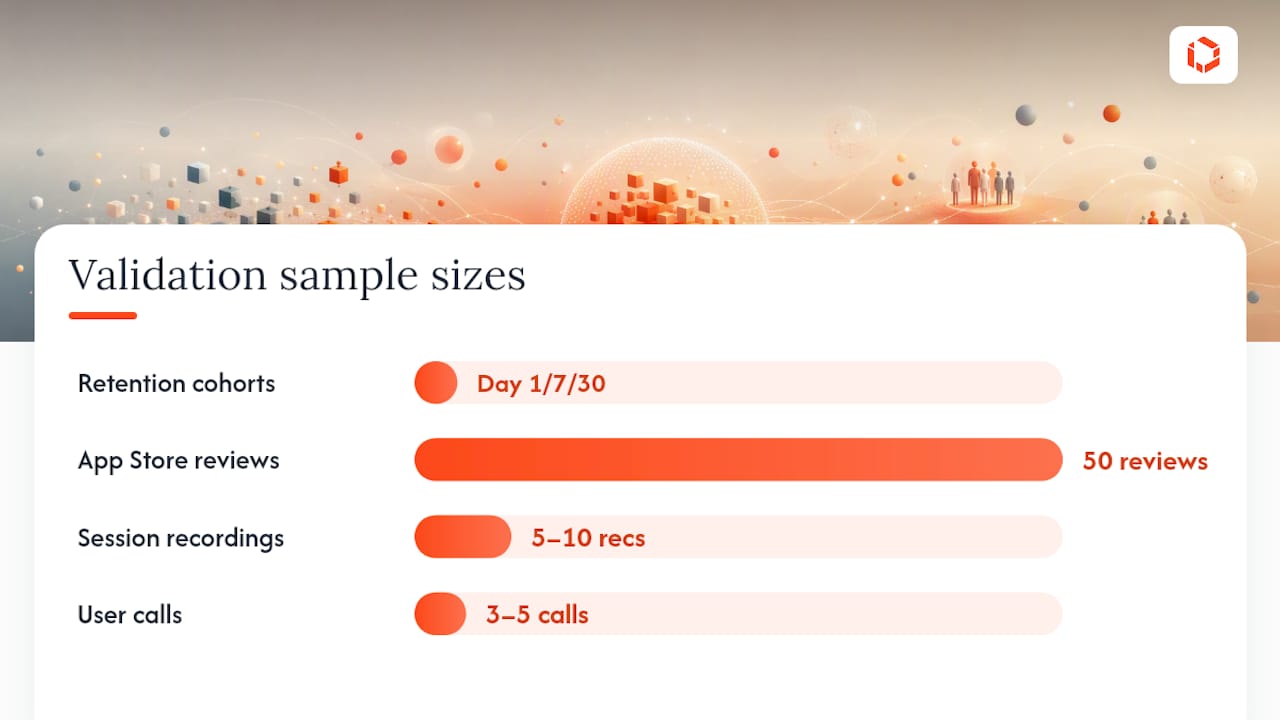
Retention cohorts: Export Day 1, Day 7, and Day 30 cohorts from Amplitude or Mixpanel. Look for a consistent downward trend across three or more sequential cohorts.
Funnel drop-offs: Map every critical flow (onboarding, activation, conversion) and identify the single step with the steepest fall-off.
Crash reports: In Firebase Crashlytics, filter by crash-free users, OS version, and device. Prioritize crashes on devices covering your top 80% of active users.
Support-ticket themes: Tag your last 60 days of tickets by feature area. Three or more tickets pointing to the same flow confirm a real problem.
App Store review sentiment: Read the most recent 50 reviews on both stores. Cluster complaints by theme.
Session recordings: Watch 5–10 recordings of the failing flow in FullStory. Look for rage taps, hesitation patterns, and unexpected exits.
Once you have this data, run three to five short user calls or guerrilla tests to confirm your behavioral hypotheses. If users describe the same friction your recordings show, the problem is real. For mobile app analytics guidance on setting up cohort and funnel views, that foundation matters before you scope any redesign work.
The key decision at this stage: are the problems presentation-only (layout, copy, visual hierarchy) or structural (broken flows, missing features, architectural constraints)? Presentation problems are a refresh. Structural problems are a redesign or rebuild.
Pro Tip: A redesign investment is strongest when behavioral data, not internal opinion, drives the decision. Duck.design's UX framework emphasizes that the most reliable signals come from what users actually do, not what they say in surveys.
What should you audit technically before redrawing any screens?
A technical audit runs parallel to the UX audit and often changes the scope of the entire project. Before estimating the redesign, separate interface-refresh work from modernization by checking SDK versions, target API levels, store requirements, and overall codebase health.
Crash logs and crash-free users in Firebase Crashlytics: a degrading trend here means engineering work comes before design work.
API latency and cold start time: measure time-to-interactive on real devices. Measure time-to-interactive on representative real devices and compare it with your current baseline and product targets. Slow startup is a performance problem that design alone cannot solve.
SDK and target API levels: check whether your app meets current App Store and Google Play requirements. Outdated dependencies create release risk.
Release fragility: if every release introduces new bugs, the codebase has accumulated technical debt that a visual redesign will not resolve.
App size and memory usage: bloated binaries hurt install conversion and performance on lower-end devices.
For performance levers and accessibility gaps, both belong in the UX audit alongside navigation clarity and onboarding abandonment rates.
Technical metric | What it indicates | First action |
|---|---|---|
Crash-free users declining | Active stability regression | Triage in Crashlytics before design work |
Cold start time worsening or exceeding product targets | Performance bottleneck | Profile with Android Studio / Xcode Instruments |
Outdated target API / SDK | Store compliance and release risk | Dependency audit and upgrade plan |
Release causes new bugs | Architectural technical debt | Code audit before scoping redesign |
App size growing significantly | Install friction, device compatibility | Asset and dependency review |
What does a realistic redesign timeline and scope look like?
Scope drives everything. Here are rough ranges, not fixed estimates:
Visual refresh (4–8 weeks): Updated typography, color system, icons, and component library. Engineering time is low; no architectural changes.
Full redesign (3–6 months): Revised information architecture, new onboarding flows, updated core screens, and engineering to implement. Involves UX research, prototyping, QA, and staged rollout.
Modernization or rebuild (6–12+ months): Required when the codebase cannot safely support the next product phase. Highest engineering cost and migration risk.
Budget is driven by the combined effort across research, design, engineering, QA, migration, and release management. A visual refresh costs a fraction of a rebuild because the engineering delta is small. The risk of a rebuild is data migration, regression testing, and user transition. Scoping an MVP for redesign, meaning the smallest set of changes that measurably improves your top two or three warning signs, limits that risk and delivers results you can measure before committing to a larger scope.
How do you roll out a redesign without losing your current users?
A phased rollout protects your existing user base while you gather evidence that the new design performs better.
Use feature flags to release new flows to a small internal cohort first.
Run a canary rollout at 5–10% of your user base before a full staged release.
Set up A/B tests on your highest-impact flows (onboarding, activation, paywall) using your analytics platform.
Use a phased release in App Store Connect for iOS and a staged rollout in Google Play Console for Android to limit early exposure while monitoring performance.
KPIs to watch post-release:
Retention cohorts (Day 1, Day 7, Day 30)
Funnel conversion rate at each critical step
Crash rate and crash-free users
Session length and DAU/MAU ratio
Support-ticket volume by feature area
App-store rating delta week over week
Pro Tip: Set rollback triggers before you launch. Define the exact threshold (e.g., crash rate rises above your pre-redesign baseline, or Day 1 retention drops more than 5% in the new cohort) that automatically pauses the rollout. Conservative thresholds on early cohorts protect your overall user base while you validate.
Should you hire an agency or redesign in-house?
The honest answer depends on four variables: time to market, internal skill coverage, technical debt level, and your need for ongoing support.
Hire an agency when:
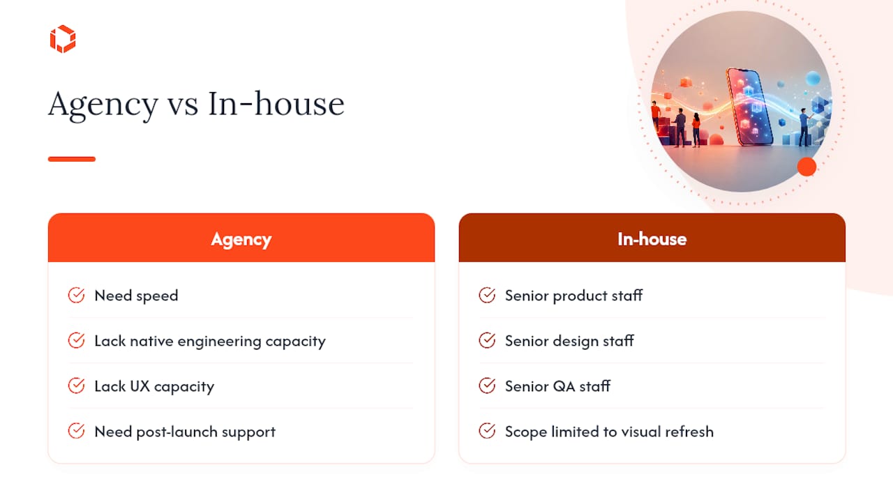
You need speed and lack a full product design and engineering team in-house.
The redesign involves native iOS, Android, or cross-platform engineering (Flutter, React Native) that your team doesn't cover.
You need an outside perspective to challenge internal assumptions about the product.
Post-launch support and iteration are part of the scope.
Build in-house when:
You have senior UX, prototyping, native engineering, and QA capacity on staff.
You have a long runway and can absorb a slower timeline.
The scope is a visual refresh, not a structural redesign or rebuild.
When screening agencies, ask these questions:
Who specifically will work on our project, and what are their seniority levels?
Can you show examples of modernization or rebuild projects, not just greenfield apps?
What does your post-launch support model look like?
How do you handle scope changes mid-project?
How do you structure QA and staged rollouts?
TouchZen's model gives founders direct access to senior developers and designers from kickoff through launch, which removes the handoff delays that slow most agency engagements.
A founder's perspective on redesigns and measurable outcomes
The most common mistake founders make is treating a redesign as a creative project rather than a product investment. The data has to come first. Small, validated changes to a single critical flow often deliver more measurable lift than a full visual overhaul. The founders who get the best outcomes from redesigns are the ones who define a specific, measurable problem before they write a single brief. Balancing design taste with behavioral evidence isn't a constraint; it's what separates a redesign that moves metrics from one that just looks different.
Ready to move from warning signs to a working redesign?
If your audit confirms multiple warning signs and shows that the problems are structural—not isolated bugs or performance regressions—the next step is a scoped redesign plan. TouchZen has launched 75+ apps across industries and client outcomes including 10x subscription growth and 100k downloads in year one. The team gives founders direct access to senior engineers and designers, not junior staff, from the first call through post-launch support.
TouchZen's mobile app redesign and development service covers the full scope: UX and technical audit, prototyping, native and cross-platform engineering, QA, and staged rollout. If your app has technical debt that a visual refresh won't fix, the team builds a staged modernization plan that limits migration risk. Book a discovery call to scope your redesign with a senior team that has done it before.
Sources
FAQ
What are the clearest signs your mobile app needs a redesign?
The clearest signs are declining Day 7 or Day 30 retention cohorts, falling conversion at a specific funnel step, a rising crash rate in Firebase Crashlytics, and a pattern of negative app-store reviews pointing to the same flow. Two or more of these together justify a formal audit.
How long does a mobile app redesign typically take?
A visual refresh typically takes 4–8 weeks. A full redesign covering information architecture and core flows runs 3–6 months. A modernization or rebuild, required when the codebase has significant technical debt, takes 6–12+ months.
Should you hire an agency or redesign in-house?
Hire an agency when you need speed, lack native engineering or UX capacity, or need post-launch support. Build in-house when you have senior product, design, and QA staff and the scope is limited to a visual refresh.
Which analytics tools help validate the need for a redesign?
Amplitude and Mixpanel handle cohort and funnel analysis. Firebase Crashlytics covers crash-free user tracking. FullStory provides session recordings that reveal friction points in specific flows.
How does TouchZen approach a mobile app redesign?
TouchZen starts with a combined UX and technical audit, scopes an MVP redesign to address the highest-impact warning signs first, and delivers through a senior team with direct founder access, covering design, engineering, QA, and staged rollout.