TOUCHZEN ®
Local time:
Jetbay

Client
Jetbay
Timeline
5 Months
Launch Year

Private aviation, but make it approachable...
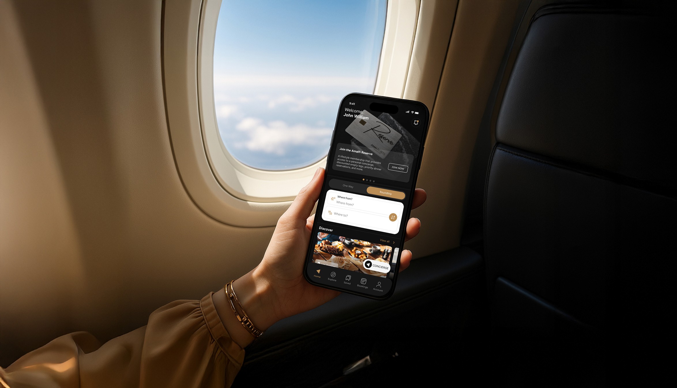
Jetbay came to us with a problem familiar across the industry: an experience defined by gatekeeping. No prices. No availability. Just a "contact us" button standing between the user and the sky. We set out to change that completely. Private aviation has long relied on opacity as a signal of luxury. The assumption: if you have to ask the price, the experience must be worth it. But for a growing audience of aspirational flyers, entrepreneurs, frequent travelers, small teams, that friction is not mystique. It is a dealbreaker. JetBay needed to stop losing these users at the first interaction. We audited competitors across private jet booking, fractional ownership, and charter services. We also looked beyond the category entirely, studying how premium travel platforms like luxury hotel booking sites and first-class flight aggregators solved similar problems. The answer consistently pointed toward one thing: radical transparency.


/Project Goals/
The project touched every consumer-facing layer. We started by redefining what JetBay should feel like: refined without being cold, premium without being opaque. That positioning shaped every decision that followed. The new logo, the type system, the color language, and ultimately the full product experience. The clearest directive for this project was to eliminate every instance of "contact for pricing." Real routes. Real dates. Real costs displayed upfront, beautifully. This required rethinking the information architecture of the entire site and app from scratch. Pricing modules, route pickers, and availability calendars had to carry the same visual weight as hero imagery in competitor sites. Beyond pricing, we prioritized legibility of the service itself. Many first-time private flyers do not know the difference between a charter, an empty leg, or a jet card. The redesigned experience explains each option contextually, at the moment of decision, rather than burying it in an FAQ.

/Results/
The final product gave Jetbay a presence that finally matched the quality of their service. The redesigned brand reads as premium without being intimidating, and the transparent pricing model opened the door to a wider audience without compromising their existing client base. The site and app now work together as a single, coherent booking ecosystem. Overall, the engagement gave JetBay a platform to grow into, scalable, consistent, and ready for audiences who have never flown private before but are ready to.
Design
Branding
Marketing
/More projects.
Project name
Description