

Joy Foroughi
Executive Assistant


Mobile App Wireframes: A Practical Guide for Non-Designers
Unlock the essentials of mobile app design wireframes with this practical guide for non-designers. Start creating effective layouts today!

TL;DR:
A mobile wireframe is a low-fidelity blueprint showing an app’s structure, navigation, and core functions before design. Creating simple, paper-based sketches helps identify logic gaps and keeps focus on user flow, not visuals. When ready, a detailed wireframe pack enables seamless handoff to designers and developers for efficient app building.
A mobile wireframe is a low-fidelity blueprint of your app's screens, showing structure, navigation, and core functionality before a single line of code or pixel of visual design is touched. Your first move: grab a pen and paper, write down the one thing your user needs to accomplish, then sketch the minimum screens that make it happen.
What wireframes are NOT: color palettes, font choices, or polished mockups
What wireframes ARE: screen-by-screen maps of what exists, where it lives, and how users move through it
Your first rule: resist aesthetic critique in early sessions; structure and flow come first
Pro Tip: Avoid "lorem ipsum" placeholder text from the start. UI element sizing depends on actual text length, so using real or representative copy prevents layout failures later.
What do wireframes actually do, and how does fidelity work?
Wireframes solve a specific problem: they force you to answer structural and flow questions before visual design or development begins. Think of them as the architectural blueprint before construction. You would not pour a foundation without one, and you should not write code without wireframes either.
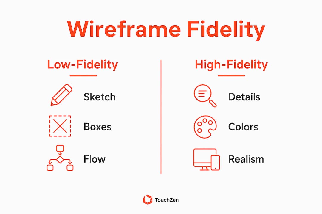
The three fidelity levels each serve a distinct purpose:
Fidelity Level | What It Looks Like | Best Used For |
|---|---|---|
Low-fidelity | Rough boxes, lines, hand-drawn | Fast exploration, logic checks |
Mid-fidelity | Accurate proportions, real labels | Layout validation, stakeholder review |
High-fidelity | Detailed gray-box specs | Developer handoff, final approval |
For mobile specifically, the portrait-first convention is the default. Most users hold their phones vertically, one-handed, so your wireframes should reflect that reality from the first sketch. The priority hierarchy for every screen follows a simple question sequence: "What's important right now? What can I do? Where can I go?" That sequence, applied consistently, keeps screens focused and prevents the feature-creep that kills early-stage apps.
One more mobile-specific discipline worth building early: the content-first approach. UI sizing depends on text length, so laying out a screen before you know what words go on it is working backwards. Write the primary content first, then build the layout around it.

Stakeholders often derail early wireframe reviews by focusing on visual design rather than flow. Keeping wireframes intentionally low-fidelity forces the conversation back to function, which is exactly where it belongs at this stage.
How to create mobile app wireframes step by step
A clear, ordered process reduces rework and speeds handoff. Here is the seven-step workflow that takes you from a blank page to a developer-ready wireframe pack.
Define the core user goal (15 minutes)
Write one sentence: "The user wants to [do X] so they can [achieve Y]." Everything you wireframe must serve that sentence. If a screen does not connect to it, cut the screen.Map a lean user flow (20–30 minutes)
List every screen the user touches from entry to goal completion. Draw arrows between them on paper. Common patterns to include early: login, dashboard, list/detail view, onboarding, and settings. Reusing these patterns speeds iteration and forces you to define error, empty, and loading states before they become surprises in development.Paper sketch key screens (30–45 minutes)
Paper sketching surfaces logic gaps faster than any digital tool. Limit yourself to five screens per session. The constraint forces simplification and reveals missing steps or illogical flows before you invest time in a digital tool.Create low-fidelity digital wireframes (1–3 hours)
Move your best paper sketches into a digital tool. Use boxes for images, lines for text, and rectangles for buttons. No colors, no fonts. Focus on placement and proportion.Add representative copy and real data (30–60 minutes)
Replace every placeholder with real or near-real content. A button that says "Submit" tells you nothing about space; "Create my free account" does. This step prevents layout failures that only show up when real content is inserted.Prototype key interactions (1–2 hours)
Create clickable prototypes for two or three critical flows, not every screen. Focus on the paths users take most often and the ones most likely to confuse them.Quick usability checks and iterate (1–2 hours)
Show your prototype to three to five people who match your target user. Watch where they hesitate or tap the wrong thing. Fix those screens, then repeat once before handoff.
Step | Deliverable | Time (Lean Session) | Time (Full Session) |
|---|---|---|---|
Define user goal | One-sentence goal statement | 15 min | 15 min |
Map user flow | Flow diagram or list | 20 min | 30 min |
Paper sketch | 3–5 rough screen sketches | 30 min | 45 min |
Low-fi digital | Annotated screen set | 1 hr | 3 hr |
Add real copy | Copy-complete wireframes | 30 min | 60 min |
Prototype | Clickable flow (2–3 paths) | 30 min | 2 hr |
Usability check | Feedback notes + revised screens | 30 min | 2 hr |
Pro Tip: For a 15-minute session, do only steps 1 and 2. A clear goal statement and a hand-drawn flow diagram are more valuable than a half-finished digital wireframe.
Mobile-specific rules every non-designer must follow
Small screens expose unclear priorities quickly. Use these guidelines to make your wireframes easier to interact with and more consistent with mobile platform standards.
Thumb reach in portrait orientation: Keep frequent and high-priority actions within comfortable thumb reach when appropriate, often toward the lower portion of the screen. Follow established iOS and Android navigation conventions rather than placing every navigation or confirmation control at the bottom.
Touch-target minimums: Android guidelines specify 48×48dp minimum; iOS specifies 44pt. Apply these at the wireframe stage, not after, so developers do not have to rework spacing during build.
Spacing between targets: Tappable elements need at least 8dp of space between them to prevent accidental taps. A wireframe that crowds buttons will produce a product that frustrates users.
Single-task screens: Each screen should answer one question or enable one action. If you find yourself putting two primary actions on the same screen, split it into two screens.
Accessibility basics: Use platform-appropriate, scalable body text, sufficient contrast between text and background with WCAG AA as a baseline, and a skip option for nonessential onboarding flows. These decisions are far cheaper to make in wireframes than in code. TouchZen's guide on accessibility in mobile development covers the practical requirements.
Mobile Rule | Standard | Why It Matters |
|---|---|---|
Touch target size (Android) | 48×48dp minimum | Prevents fat-finger errors |
Touch target size (iOS) | 44pt minimum | Matches Apple HIG guidelines |
Minimum spacing between targets | 8dp | Reduces accidental taps |
Body text | Platform-appropriate and scalable | Supports readability and accessibility |
Primary action placement | Within comfortable reach and consistent with platform patterns | Supports easier one-handed interaction |
Which tools make wireframing easiest for non-designers?
Start with paper. It is the fastest validation tool available, costs nothing, and forces you to simplify. Once your paper sketches survive a logic check, move to a digital tool for sharing and iteration.
Paper and pen: Use for steps 1–3 every time. Do not skip this. The friction of drawing by hand is a feature, not a bug. It stops you from over-designing too early.
Balsamiq: Built specifically for low-fidelity wireframing. Its intentionally sketchy visual style signals to stakeholders that the design is not final, which keeps feedback focused on structure. Best for rough workshops and early-stage exploration.
Figma: Scales from mid-fidelity wireframes all the way through to developer handoff. Its component systems and community kits mean you can find mobile UI starter templates in minutes. Free tier is sufficient for most non-designer wireframing needs. Best for teams that want one tool from wireframe to handoff.
AI-assisted tools: AI can help generate rough starting-point screens, but every flow still needs to be checked against real user needs, business logic, and platform conventions. Treat generated layouts as early drafts rather than finished wireframes.
Where to find starter templates:
Figma Community: search "mobile wireframe kit" for free component sets with pre-built iOS and Android frames
Balsamiq's own template library includes login, dashboard, onboarding, and settings patterns
Paper wireframe printables (search "mobile wireframe template PDF") give you pre-drawn phone outlines for fast sketching sessions
Tool | Fidelity Range | Best For | Cost |
|---|---|---|---|
Paper and pen | Low | Logic validation, first sessions | Free |
Balsamiq | Low to mid | Rough workshops, stakeholder alignment | Paid (free trial) |
Figma | Mid to high | Full workflow, team collaboration, handoff | Free tier available |
AI layout tools | Low to mid | Fast starting-point generation | Varies |

What designers and developers need from your wireframes
A wireframe that cannot be handed off is just a sketch. The goal is a package that lets a designer or developer pick up your work and move forward without a two-hour explanation call.
Handoff checklist:
Annotated screens with notes explaining non-obvious interactions
Real copy examples on every screen (no lorem ipsum)
Interaction notes: what happens when a user taps X, swipes Y, or submits a form
Edge and empty states: what does the screen look like when there is no data, an error, or a loading state?
Platform expectations: note whether the app targets iOS, Android, or both, and flag any platform-specific patterns you have used
How to annotate effectively:
Annotations do not need to be elaborate. A numbered callout system works well: place a number next to a UI element, then list the corresponding note below the screen. Focus your annotations on:
Navigation behavior (what does the back button do here?)
API-driven data placeholders (this list pulls from the user's order history)
Conditional states (this button is disabled until the form is complete)
Any interaction that is not self-evident from the wireframe alone
Questions to ask your designer and developer before handoff:
What file format do you prefer for wireframes?
Are there existing component libraries or design systems I should reference?
What platform-specific constraints should I know about for this project?
How do you want edge and empty states documented?
For a broader view of how wireframes fit into the full development workflow, the mobile development workflow guide covers where wireframes hand off to design and build phases. Understanding what designers expect from UI also helps you write better annotations.
When should you keep wireframing yourself vs. hire an agency?
DIY wireframing is the right call for most early-stage founders. It is fast, cheap, and forces you to think through your product before spending money on design or development. But there are clear signals that tell you when professional help will pay for itself.
Keep wireframing yourself when:
You are validating a concept and need to move fast
Your app has fewer than 10–12 core screens
You are preparing for an early user interview or internal alignment meeting
Budget is constrained and the goal is a testable prototype, not a polished product
Hire a professional designer or agency when:
Your app spans multiple platforms (iOS and Android with different interaction patterns)
You are preparing for an investor presentation and need polished, high-fidelity screens
Regulatory or accessibility requirements apply (healthcare, fintech, government)
Scope has grown beyond what a single non-designer can manage without introducing inconsistency
Your wireframes have been through two or more rounds of feedback and the core flow is still unclear
What to prepare before you contact an agency:
A useful first consult requires more than "I have an app idea." Bring a brief that includes your user goal statement, your hand-drawn or low-fi wireframe pack, a list of the core screens, and any user research or feedback you have already collected. Agencies can move faster and give you more specific guidance when you arrive with this material.
Pro Tip: Scope creep in wireframing is real. Set a hard limit on the number of screens per wireframing session and require sign-off on each flow before adding new ones. Every unreviewed screen you add is a potential rework cycle later.
Key Takeaways
Wireframing is the single highest-leverage activity a non-designer can do before committing to design or development: it surfaces structural problems early, aligns teams on flow, and produces a handoff package that saves hours of rework.
Point | Details |
|---|---|
Start on paper | Sketch the core user flow by hand before opening any digital tool to surface logic gaps fast. |
Match fidelity to stage | Use low-fidelity for exploration, mid-fidelity for layout validation, and high-fidelity specs for handoff. |
Apply mobile standards | Touch targets must meet 48×48dp (Android) or 44pt (iOS) minimums; place primary actions in the bottom third of the screen. |
Use real copy early | Replace placeholder text with representative content at the wireframe stage to prevent layout failures in development. |
TouchZen for expert handoff | When scope, polish, or platform complexity exceeds DIY capacity, TouchZen's senior design team picks up from your wireframe pack. |
The wireframe mistake most non-designers make
The most common error non-designers make in wireframing is not starting too simple. It is starting too late and then trying to compensate with complexity.
By the time most founders open a digital tool, they have already spent weeks thinking about features. That mental load produces wireframes with 30 screens, three navigation patterns, and five onboarding variants, none of which have been tested against a real user. The result is a wireframe pack that looks thorough but has never been validated, and a development team that inherits every unresolved decision as a bug.
The fix is not a better tool. It is a tighter constraint. One user goal. Five screens. Paper first. Show it to three people before you add a single screen. The discipline of that constraint is what separates wireframes that accelerate a project from ones that generate scope creep.
The other pattern worth naming: non-designers often treat wireframe feedback sessions as design reviews. They invite stakeholders who immediately ask about colors, fonts, and branding. Keeping wireframes intentionally rough, even deliberately sketchy, is a communication strategy. A polished wireframe invites polish feedback. A rough one invites flow feedback. You want flow feedback.
TouchZen can take your wireframes further
If your wireframe pack is ready but the next step—turning it into a production-quality app—feels beyond your team’s capacity, TouchZen offers a direct path forward. TouchZen connects you with senior designers and developers from the first call, helping preserve the intent behind your wireframes throughout design and development.
TouchZen has shipped 75+ apps across industries, generating 20M+ downloads and earning 12+ features from Apple and Google. When you bring a wireframe pack, a user goal statement, and your core screen list, the first consultation can become a focused working session rather than a broad discovery exercise. That preparation can reduce time spent in the early design phase.
For founders who need full product development from wireframe to launch, the mobile app development service covers the complete build. If your needs are narrower, the UX/UI design service handles wireframe refinement, high-fidelity design, and developer handoff as a standalone engagement. Reach out with your wireframe pack and user goal statement to get a scoped estimate.
Useful sources and starter resources
Balsamiq: Mobile app wireframing guide — step-by-step tutorial with fidelity explanations and mobile-specific patterns
Figma: What is wireframing? — resource library covering wireframe concepts and Figma's community template kits
Codecademy: Mobile app wireframing — covers portrait-first design, thumb reach, and touch-target standards
UIGuides: How to wireframe an app — practical workflow with content-first and paper-first guidance
MockFlow: Wireframing for mobile apps — workflow overview with prototyping and handoff steps
Coursera: Introduction to UI Design — beginner-friendly course covering user-centered design and interface evaluation
Envato Tuts+: UI Design for Beginners — free course that walks through wireframing to styled mockup using real mobile dimensions
TouchZen: UI design guide for startups — explains how wireframing connects UX problems to UI solutions
FAQ
What is a mobile wireframe in simple terms?
A mobile wireframe is a low-fidelity blueprint of your app's screens that shows structure, navigation, and core functionality without any visual styling. Think of it as the floor plan before the interior design.
Do I need design skills to create wireframes?
No. Paper sketches and beginner-friendly tools like Balsamiq or Figma's free tier are built for non-designers. The goal is communicating structure and flow, not producing polished visuals.
What is the difference between low-fidelity and high-fidelity wireframes?
Low-fidelity wireframes are rough sketches used for fast exploration and logic checks; high-fidelity wireframes are detailed gray-box specs used for developer handoff and final approval.
How many screens should a first wireframe include?
Start with the minimum screens needed to complete the core user goal, typically five to ten screens. Adding more before validating the core flow creates scope creep and rework.
When should a non-designer hire a professional instead of wireframing alone?
Hire a professional when your app spans multiple platforms, requires regulatory compliance, needs investor-ready polish, or when two rounds of feedback have not resolved the core flow. TouchZen's senior design team works directly from your wireframe pack to move efficiently into production.
Recommended


