

Joy Foroughi
Executive Assistant
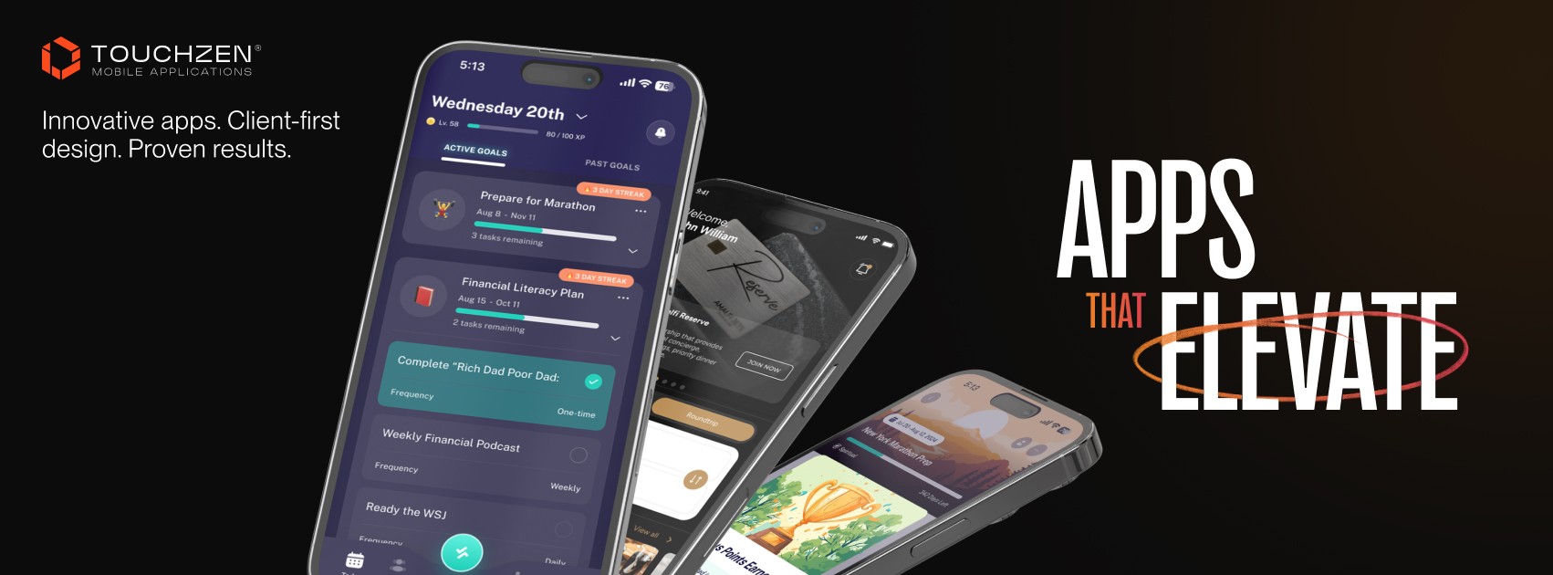
Mobile App Onboarding That Survives Day 7: First-Run Flow Patterns That Lift Retention
Mobile app onboarding best practices that lift Day 7 retention. Practical first-run flow patterns, permission timing, and activation tips for founders. Most mobile apps lose the majority of their users in the first seven days. The reason is rarely the product itself, It's the first run. Here's how to design onboarding that gets users to value fast and keeps them coming back.

Introduction
For most mobile apps, the audience is decided in the first seven days. The pattern is consistent across categories: the steepest drop in active users happens during week one, and a meaningful share of that loss occurs in the first 48 hours. Founders tend to focus on long-term retention curves, but the shape of those curves is almost entirely set during the first run. If users don't come back by Day 7, in most categories, they're gone.
What makes this frustrating is that the cause is rarely the product. The features work. The design is clean. The value is real. But somewhere between the App Store install and the second session, something breaks—and that something is almost always the onboarding.
Mobile app onboarding best practices have very little to do with polishing a welcome screen. The work is closer to engineering: building the shortest credible path from "I just downloaded this" to "I see why I'd come back tomorrow." Get that path right and Day 1, Day 7, and Day 30 retention all move together. Get it wrong and users leak out invisibly, with no marketing spend large enough to plug the hole.
This guide walks through what onboarding should actually do, the mistakes that cost retention, the first-run patterns that hold up across categories, and a checklist founders can take back to their teams on Monday.
What Mobile App Onboarding Should Actually Do
The most useful reframe: onboarding is not a tutorial. It's an activation sequence.
A strong first-run flow does three things, in this order:
Helps the user understand what the app is for, in their own context and their own words.
Gets them to a first moment of real value as quickly as the product allows.
Sets up the conditions for a second session—a personalized home screen, the right permission granted, an unfinished action worth returning for.
Notice what isn't on that list: feature tours, swipeable intro screens, product walkthroughs. Those belong to a different era of app design, when founders confused onboarding with education. Users don't need a tour. They need a result.
Here's a sharper way to hold it: every screen between install and first value is a tax. Every tap is a chance to lose someone. Onboarding doesn't teach—it delivers.
Common Onboarding Mistakes
A handful of patterns show up in nearly every app with weak first-week retention:
Asking for permission before delivering value. Push, location, contacts, and camera prompts on the welcome screen get rejected by users who haven't been given a reason to say yes.
Long swipeable intro carousels. Three to five marketing screens before the user can do anything. These almost always suppress activation.
Forced account creation up front. Demanding email or phone before the user has seen the product is one of the largest causes of drop-off, especially in marketplace, fitness, and productivity apps.
Empty home screens after signup. The user arrives, sees nothing, and has no idea what to do next.
Hidden core value. The thing the app is actually good at sits two or three menus deep, while onboarding shows off secondary features.
No second-session hook. The app delivers something once and gives the user no concrete reason to come back tomorrow.
Each of these is fixable in a single sprint. The compounding effect of fixing several at once is often visible in retention numbers within a week of release.

First-Run Flow Patterns That Lift Retention
A few patterns have proven themselves across categories. None of them are new. Most apps still don't execute them well.
Progressive Profiling
Don't collect everything at signup. Collect what you need to deliver the next moment of value, and ask for the rest when context calls for it.
A meal-planning app doesn't need dietary preferences on signup—it needs them right before generating the first plan. A fintech app doesn't need an SSN on signup; it needs an email and a financial goal, then verification when the user is ready to connect an account. A productivity app doesn't need team size at the door—it can ask when the user starts inviting collaborators.
Progressive profiling lifts completion rates because each question arrives at the moment it actually makes sense.
Permission Timing
The order in which you request system permissions has more impact on long-term engagement than almost any other onboarding decision. In most cases, permission prompts shouldn’t appear on first launch.
Tie each prompt to the moment its value is obvious:
A fitness app asks for motion and health data when the user starts their first workout, not on signup.
A marketplace app asks for location when the user searches for something nearby, not the second the app opens.
A messaging app asks for contacts when the user taps "Invite a Friend," not before.
In practice, contextual prompts often double long-term opt-in rates compared to asking cold.
Personalization Early
Small personalization shifts make the app feel like it belongs to the user. A short preference quiz—two or three questions, no more—lets the home screen reflect actual intent on first open.
A health app might ask, "What brought you here today?" with a few clear options. A productivity app might ask the user's primary use case. A marketplace might ask which category they're shopping in. Whatever the answers, they feed directly into the first home screen, so when the user lands, they see something built for them.
Smart Empty States
A blank home screen kills momentum. Instead of showing nothing, show what the user can do next.
Productivity apps can pre-populate a sample project or template that the user can edit or delete.
Fitness apps can show recommended workouts based on the preference quiz.
Fintech apps can show a sample goal or a clear "Connect your first account" card.
Marketplaces can surface popular items in the user's category before any browsing history exists.
The empty state is one of the highest-leverage screens in the entire app—and the one most teams overlook.
Onboarding Checklists
A short checklist on the home screen—three to five items—gives users a visible path to full activation. Each item should represent a real step toward value: complete profile, add first item, invite a teammate, connect an account, log a first workout.
Checklists work because they convert a vague "explore the app" feeling into a concrete sequence. The pull of crossing off items is real, and users who complete a checklist tend to retain at noticeably higher rates than those who don't.
Early Value Moments
The most important onboarding decision is naming the app's first real value moment—then getting users to it as quickly as the product will allow.
For a fitness app, it might be completing the first workout. For a budgeting app, seeing a forecast of next month's balance. For a marketplace, saving the first item. For a learning app, finishing the first short lesson. For a productivity tool, creating the first task and watching it sync across devices.
Every screen between install and that moment deserves to be questioned. If a screen doesn't move the user closer to value, it's a candidate for removal.
How to Measure Onboarding Success
Most teams measure onboarding by completion rate—what percentage of users finish the flow. That's the wrong metric. A short, broken onboarding can have a high completion rate. A strong one might have a slightly lower number while shipping users into the product fully activated.
A better measurement stack:
Time to first value. From install to the first real moment of usefulness. Shorter is almost always better.
Activation rate. The percentage of new users who complete a defined activation event—first workout logged, first project created, first account connected.
Day 1, Day 7, and Day 30 retention for users who completed onboarding versus those who didn't.
Permission opt-in rate, measured cohort by cohort, for every prompt you trigger.
Drop-off by step. Which onboarding screen loses the most users? That screen is the next one to redesign.
The goal isn't to optimize a single number. It's to see clearly which step is leaking and fix it.
A Practical Onboarding Checklist for Founders
Before shipping or reviewing your first-run flow, work through these questions:
Does the user reach a real value moment in under two minutes?
Are permission prompts triggered in context, not on first launch?
Is account creation deferred as long as the product allows?
Does the home screen show something useful on first open—not a blank state?
Are profiling questions spread across the journey instead of stacked at signup?
Is there a visible checklist or next step on the home screen for new users?
Do you have an event for "user reached first value," and are you measuring time to it?
Is there a concrete reason for the user to return within 24 hours?
Have you watched at least five real users go through onboarding from scratch?
If two or more of these are "no," onboarding is almost certainly the largest retention lever available to you this quarter.
Building Onboarding That Holds Up with TouchZen Media
Onboarding sits in a strange place in the development cycle. It's the first thing a user experiences and often the last thing a team finishes. The gap between an average first run and an excellent one is rarely about visual design—it's about sequencing, timing, and a handful of quiet decisions made early in development. The teams that treat first-run as a first-class part of the product almost always outperform competitors who treat it as a wrapper around the real app.
At TouchZen Media, we've worked with founders and product teams across fitness, fintech, marketplaces, health, productivity, and more—on mobile apps where activation and retention are designed in from the first sprint, not patched on later. If you're planning a new app, or wondering why early users aren't sticking around, we'd be glad to take a look at your first-run flow and walk through what could change.


