
Joy Foroughi
Executive Assistant


Paywall Design Best Practices That Convert in 2026
Discover effective mobile app paywall design best practices for 2026 that boost conversions and maximize revenue through smart structural choices.

Structure beats decoration every time. Fix your paywall's placement, trial length, and plan defaults before you touch a single pixel of copy or color, and you'll see more revenue movement than a full redesign typically delivers. Structural decisions explain most of the gap between median-performing subscription apps and the top tier, according to analysis across large paywall datasets. Visual polish matters eventually. It's not where the money is hiding.
If you're building or rebuilding a paywall this quarter, work through six structural levers in this order:
Paywall model — hard gate, soft gate, trial, freemium, or pay ramp
Placement and timing — onboarding, feature gate, or post-close offer
Trial length — how many days before the charge hits
Plan structure and default selection — which tier is preselected and why
Price anchoring — how options are framed against each other
Experiment roadmap — what you test first, and how you measure it
Before changing anything else, check your paywall visibility rate (the percentage of new users who actually reach the paywall) and your ARPU.
Key Takeaways
Structural paywall decisions, placement, trial length, and plan defaults, drive more revenue than visual or copy changes, and should be tested and fixed first.
Point | Details |
|---|---|
Fix structure before style | Prioritize placement, trial length, and plan defaults before touching copy or visual design. |
Check visibility rate first | If fewer than 80% of new users reach the paywall, solve reach before optimizing the screen itself. |
Favor longer trials | Trials of 17 to 32 days generally convert better than shorter trials of 3 to 7 days. |
Test one structural change at a time | Isolate trial length or plan defaults rather than changing multiple levers in the same experiment. |
Measure ARPU over one renewal cycle | Use ARPU or LTV as the primary metric for pricing and trial-length tests, not just conversion rate. |
Work with an experienced practitioner | TouchZen has launched 75+ apps and applies this audit-first, ARPU-measured sequence in client engagements. |
Mobile App Paywall Design Best Practices: Choosing the Right Type
Not every subscription app should run the same paywall model. The type you choose determines how much of your funnel converts and how good the users who do convert turn out to be.
Hard gate. Users hit a locked wall before they can use core functionality. This works when your app's value is obvious in the first ten seconds, think premium filters or a single killer feature. It maximizes revenue per visible user but sacrifices reach.
Soft gate. Users get partial access, then get nudged toward upgrading once they hit a limit or unlock a premium feature. This suits productivity and utility apps where habit formation drives the eventual purchase decision.
Free trial. Full access for a set window, then automatic conversion to paid. Trials work best for apps with a learning curve or a delayed "aha" moment, fitness, language learning, journaling.
Freemium. A permanently free tier alongside a paid tier with more features. This maximizes total user base and word-of-mouth reach but tends to produce lower conversion rates and a longer path to monetization.
Pay ramp. Pricing or access tightens gradually over multiple sessions rather than all at once. This model reduces the shock of a single hard paywall and works well for apps with high day-one drop-off risk.
Multi-page paywall. Instead of one screen with everything, the offer unfolds across two or three screens, building context before asking for the card. This tends to outperform single-page paywalls because it reduces the moment of decision friction, according to a study of nearly 3,000 paywalls.
The trade-off across all six is always the same triangle: reach, lifetime value, and funnel quality. Widen the top of the funnel with freemium or a soft gate, and you often trade away LTV per converted user.
Pro Tip: If you're unsure which model fits, look at your habit-formation timeline. Apps where value shows up in session one lean toward hard gates or short trials. Apps where value compounds over weeks need freemium or pay ramps to keep users around long enough to feel it.
What Are the Six Structural Decisions That Drive Paywall Conversion?
Six decisions explain most of the performance gap between an app converting at the median and one converting well above it: paywall model, placement timing, plan structure, trial strategy, price level, and the experiment roadmap you run afterward. Each one works through a different mechanism, and knowing which lever to pull first saves you months of testing the wrong thing.
Paywall model sets the ceiling on both reach and revenue per user, as covered above.
Placement timing determines how many users even see the offer. Onboarding placements produce dramatically more trial starts than paywalls buried three or four screens deep, and RevenueCat's research found roughly 82 to 90% of trial starts happen on day zero.
Plan structure and default selection shape which tier users actually pick. Pre-selecting your highest-value plan shifts choice toward it; a surprising number of apps still default to the cheapest option, which quietly caps ARPU.
Trial strategy affects how many trial users convert to paying customers, covered in depth in the next section.
Price level sets the revenue ceiling per converted user, and needs to be tested against willingness-to-pay signals, not guessed at.
Experiment roadmap determines how fast you learn which of the above actually matters for your specific app and audience.
2026 benchmark: Structural experiments, testing localization, trial length, and plan duration, win far more often than visual or copy changes. Benchmark data shows visual and copy tests win only about 34 to 35% of the time, meaning most cosmetic A/B tests come back flat or negative.
If you're starting from scratch, prioritize in this order: fix visibility rate and placement first, then trial length, then plan defaults and anchoring, then price level, and only then move to layout and copy. Teams with limited traffic should run one structural test at a time rather than spreading a small sample across five simultaneous changes; underpowered tests on multiple variables produce noise, not answers.
When Should a Paywall Appear in the User Journey?
Placement is the single fastest lever most teams underuse. A paywall shown during onboarding, before the user has fully evaluated the app, captures intent while it's highest. Waiting until a feature gate or a post-close offer means competing against a user who has already decided whether they like your app without you.
The data backs this up firmly: onboarding paywalls more than double conversion compared with paywalls triggered later in the user journey. That doesn't mean every app should slam a paywall on screen one. Apps with a genuine learning curve benefit from a soft preview, letting the user touch the core feature once, then presenting the offer. The principle holds either way: the earlier a motivated user sees your offer, the more of that motivation you capture. Review your onboarding flow alongside your paywall placement, since the two are really one funnel, not two separate decisions.
How Long Should a Free Trial Last?
Longer trials generally beat short ones. Trial windows of 17 to 32 days produce a trial-to-paid conversion rate around 45.7%, compared with 26.8% for trials of just 3 to 7 days, according to 2026 benchmark data drawn from a dataset of more than 75,000 apps. The mechanism is habit formation: a week isn't enough time for most apps to become part of someone's routine, but three to four weeks usually is.
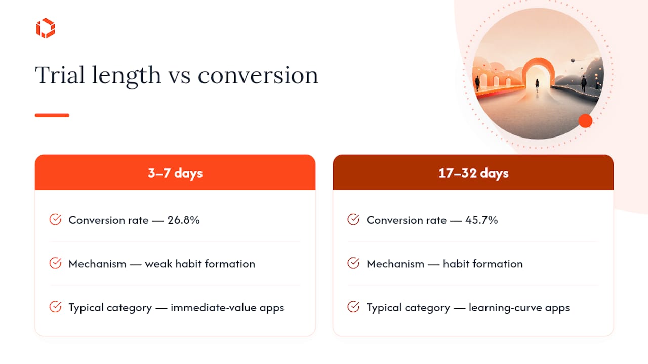
The right length still depends on your category. A meditation app might need three weeks before the habit sticks. A photo-editing tool might convert just as well on a three-day trial because the value is obvious immediately. Test your specific number instead of copying a benchmark wholesale, but start from the longer end if your category has any learning curve at all.
Structuring Your Paywall Screen for Maximum Conversion
The order information appears on your paywall screen matters as much as what that information says. The sequence that consistently converts best runs: outcome first, then value, then trust, then price, and the call-to-action last.
Users open a paywall asking one question: "What do I get?" Leading with price before answering that question forces a comparison against nothing, and nothing looks expensive. Leading with the outcome (lose weight, learn a language, get organized) frames the price as the cost of a result rather than the cost of an app. Only after the outcome and supporting value points land should trust signals and pricing appear, with the CTA anchoring the bottom of the screen where the eye naturally lands last.
Two layout techniques matter beyond ordering:
Preselect your best plan. Default selection nudges choice, and apps that default to their highest-value tier instead of the cheapest one tend to see meaningfully higher ARPU.
Use price anchoring. Placing a mid-tier plan next to a clearly better annual option makes the annual plan look like the obvious choice, a packaging effect that practitioner analysis of thousands of A/B tests consistently finds outperforms price cuts.
Design for thumb-driven scanning. Mobile screens reward large, high-contrast CTAs, minimal scrolling, and one clear pattern interrupt (a highlighted "most popular" badge) rather than three competing visual signals.
Pro Tip: Write your CTA button copy as an outcome, not an action. "Start my 30-day trial" consistently reads warmer than "Continue" or "Subscribe," and small wording shifts like this are worth testing alongside your button design since copy and layout interact more than teams expect.
Which Trust Signals Actually Reduce Paywall Drop-Off?
Every paywall asks a stranger to trust you with a recurring charge. Trust elements exist to lower the perceived risk of that decision, and the ones that work share a common trait: specificity beats vague reassurance every time.
Star ratings with review counts ("4.8 stars, 40,000 reviews") work better than a rating alone, since the count signals scale.
Outcome-linked testimonials ("Lost 12 pounds in six weeks") outperform generic praise ("Great app!") because they answer the user's actual question.
Recognition badges (App Store editor picks, press mentions) carry weight but only when real and current.
Clear trial timelines stated in plain language ("You won't be charged until [date]") reduce anxiety around forgetting to cancel.
"Cancel anytime" phrasing placed near the CTA, not buried in fine print, measurably reduces perceived lock-in risk.
Reminder flows before a trial converts to paid cut down on angry refund requests and one-star reviews tied to surprise charges.
A short FAQ or a simple visual timeline of "what happens on day 1, day 7, day 30" fits well below the CTA without cluttering the primary decision area. Keep it collapsed or scrollable rather than competing for space with the offer itself.
What Should You Test First on Your Paywall?
Test structure before style, and size every experiment to your actual traffic before committing to a run length. The order matters because early wins compound: fixing placement or trial length changes your baseline, and testing cosmetic details against an unoptimized baseline wastes a test cycle.
Fix visibility rate first. If fewer than 80% of new users reach your paywall, that's a routing or onboarding problem, not a design problem. Solve it before you touch anything downstream.
Test trial length and placement. These are the highest-win-rate experiments in current benchmark data, ahead of visual or copy changes, and they touch the largest share of your funnel.
Test plan structure and default selection. Move your default from the cheapest tier to your highest-value tier and measure the ARPU shift, not just the raw conversion rate.
Test price level and anchoring once the structural pieces are settled, so you're testing price against a funnel that's already performing near its ceiling.
Move to layout, copy, and visual polish last. These changes still matter, they just carry lower average win rates and should be tested against a stable structural baseline.
Choose your primary metric based on what you're testing. Conversion rate works fine for placement and visibility tests. For anything touching pricing, trial length, or hard-versus-soft-gate decisions, ARPU or LTV is the safer primary metric, since a change can lift day-one conversion while quietly hurting the metric that pays your bills. Align your evaluation window to at least one full renewal cycle when you're running LTV-sensitive tests. A two-week readout on a monthly-plan pricing test tells you almost nothing about churn.
Pro Tip: Resist the urge to peek at results daily and call a winner early. A test that looks like a 20% lift on day three regularly regresses to single digits by day fourteen once the novelty effect fades.
Paywall Design Patterns You Can Test This Quarter
Four patterns cover most of what's worth testing right now, each with a different trade-off between conversion speed and long-term revenue quality.
Multi-page flow. Screen one states the outcome, screen two shows value points, screen three presents pricing. This spreads decision friction across steps instead of front-loading it, and tends to outperform single-screen paywalls, particularly for apps solving an emotional or aspirational problem.
Minimal single-screen. One outcome statement, three bullet value points, one plan comparison, one CTA. This works best for utility apps where the user already understands the value and just needs a fast, low-friction path to paying.
Pay ramp. Full access for session one, then a gentle reminder and partial lock on session two, escalating toward a full paywall by session four or five. This suits apps worried about day-one abandonment from a hard ask too early.
Onboarding-embedded offer. The paywall appears as the final step of account setup rather than a separate screen, framed as "finish setting up your plan" instead of "buy now."
Design is the finishing touch. Packaging decisions, plan selection, default choice, and anchoring, explain far more of the conversion differential between apps than font choice or button color ever will.
Micro-copy worth testing alongside layout: replace "Subscribe Now" with a specific outcome-based CTA, and pair "Cancel anytime" with a visible date rather than a vague promise. Choose long-form multi-page flows when your product needs explanation before the ask lands; choose minimal single-screen when the value is already obvious; choose a pay ramp when your churn data shows most drop-off happens in session one. For high-intent or returning users, an app-to-web checkout flow can also speed up your experiment cadence, since web pricing pages iterate faster than anything gated behind an app store review cycle.
How TouchZen Applies These Paywall Best Practices
TouchZen has shipped more than 75 apps across industries, and the pattern holds every time: teams that fix structure before style see the biggest jump in subscription revenue, not the teams that spend a sprint polishing button gradients.
The sequence TouchZen runs with client teams looks like this:
Audit first. Map current placement, trial length, plan defaults, and visibility rate before proposing a single change.
Run one structural test at a time. Trial length or plan default, not both simultaneously, so the readout is clean.
Measure ARPU, not just conversion rate. A test that lifts sign-ups but tanks average revenue per user is not a win.
Iterate on a fixed cadence. Foundation fixes in the first 30 days, optimization experiments across the next 60.
Client benchmark: Across TouchZen's paywall template library, structural changes, trial length and plan default shifts specifically, have produced the largest single-test revenue jumps of any experiment category, consistent with the 2026 industry data on structural versus cosmetic win rates.
Teams that adopt this sequence tend to avoid the trap of running five simultaneous paywall changes and having no idea which one moved the needle.
Building an Accessible Paywall for Every User
An accessible paywall isn't a compliance checkbox, it's a conversion lever, since a screen a user can't read or navigate converts nobody. The core standard to design against is the Web Content Accessibility Guidelines (WCAG) 2.2, which most app teams treat as the practical baseline even though it was written for web content.
A few rules matter most on a paywall specifically:
Contrast ratio matters more than it looks. Your orange CTA against a light background needs at least a 4.5:1 contrast ratio for body text and 3:1 for large text, or users with low vision simply won't see the button.
Touch targets need real size. A 44 by 44 point minimum tap target keeps the CTA usable for users with motor impairments or anyone using the app one-handed on a crowded train.
Screen reader labels aren't optional. Every plan option, price, and button needs a descriptive label, not just visual styling, so VoiceOver and TalkBack users understand what they're selecting.
Text needs to scale. Support dynamic type so users who increase their system font size don't get a paywall with clipped or overlapping text.
Avoid color as the only signal. A "best value" badge should carry a text label, not just a color change, for users with color vision deficiencies.
Building these in from the first sprint costs far less than retrofitting them after launch, and an accessible paywall widens your addressable market rather than narrowing it.
Personalizing Paywalls by User Behavior and Segment
A single paywall shown to every user leaves revenue on the table, because a first-time visitor, a returning lapsed user, and a power user hitting a feature limit are not making the same decision. Personalization means adjusting the offer, not just the wording, based on where someone sits in that behavior.
New users typically respond best to an outcome-first paywall with a longer trial, since they haven't yet formed an opinion about whether the app works. Returning users who churned once often need a different message entirely, frequently a win-back discount or a shorter trial paired with "what's new since you left" framing. Power users bumping against a feature limit respond well to a contextual, feature-specific paywall ("Unlock unlimited exports") rather than a generic upgrade screen, because the value is self-evident at the exact moment of friction.
Segmentation by acquisition source also matters. A user who arrived through a paid ad promising a specific outcome converts better on a paywall that echoes that exact promise than on a generic template. Behavioral segmentation, tracking session count, feature usage depth, and time since install, lets you swap paywall variants dynamically rather than running one static screen for your entire user base. This is a more advanced lift than most teams start with, but it consistently outperforms a one-size-fits-all screen once the basic structural decisions are already in place.
Designing Paywalls for Foldables, Wearables, and AR
Screen shape is no longer a solved problem. Foldable phones, AR headsets, and wearable companions each demand a different paywall layout, and a design that only works on a standard 6-inch rectangle will break, or simply look wrong, on anything else.

Foldables introduce a real design decision: does your paywall use the extra width on the unfolded screen to show a side-by-side plan comparison, or does it simply stretch a phone layout and waste the space? The better answer is usually a responsive layout that adds a second column of value points or plan details only when the extra width is actually available, rather than shipping one fixed layout and hoping it scales.
AR and mixed-reality interfaces change the interaction model entirely. Gaze-and-pinch selection instead of taps means your CTA needs a larger effective target and longer dwell-confirmation time to avoid accidental purchases, a real risk when the confirmation gesture is a glance rather than a deliberate tap. Wearables, meanwhile, mostly shouldn't run a full paywall at all. A watch screen showing a multi-plan comparison is a design failure; the better pattern is a simple prompt that hands the decision off to the paired phone.
None of these are mass-market priorities yet for most teams. Building a flexible, componentized paywall layout now, rather than a single hardcoded screen, means you're not rebuilding from scratch when a meaningful share of your users show up on a foldable or a headset instead of a standard phone.
Legal and Ethical Rules Every Paywall Should Follow
A paywall that converts through confusion instead of clarity creates refund disputes, chargebacks, and app store rejections, all of which cost more than the short-term revenue it captured. Transparency isn't just good practice, it's often a legal requirement.
In the United States, the FTC's guidance on negative option and subscription billing requires clear disclosure of price, billing frequency, and cancellation terms before a user's payment information is collected, and the FTC's "click-to-cancel" rule requires that cancellation be at least as easy as sign-up. Both Apple's App Store Review Guidelines and Google Play's subscription policies enforce similar disclosure requirements at the platform level, and violating them risks app rejection, not just regulatory exposure.
Practical rules that keep a paywall on the right side of both the law and user trust: state the exact price and billing date before the trial converts, never pre-check a box that adds an unrequested add-on, and make the cancel path as findable as the subscribe path. Data privacy matters here too. If your paywall personalization relies on behavioral or location data, disclose that use clearly, since regulations like the California Consumer Privacy Act require it and users increasingly expect it regardless of jurisdiction. A paywall built on hidden terms might win a quarter of strong metrics. It rarely survives the app store review, or the review left by the user who feels tricked.
The One Experiment I'd Run This Quarter
If you take one thing from this article, test attaching your free trial to the annual plan and preselecting it as the default. This single change touches trial strategy, plan structure, and default bias at once, three of the six structural levers, without requiring a redesign.
Don't run it alongside three other changes. Isolate it, measure ARPU across at least one renewal cycle, and resist calling a winner before that window closes. The biggest mistake teams make isn't picking the wrong experiment. It's changing five things at once and never learning which one actually worked.
— Cyrus
Get a Paywall Audit From TouchZen
TouchZen fixes the structural gap between a paywall that looks finished and one that actually converts, without the months of trial and error most teams spend guessing at plan defaults and trial length on their own.
TouchZen's senior team, the same people who write the code, not a junior account manager, runs a paywall and monetization audit that maps your current placement, trial strategy, and plan structure against the benchmarks covered in this article, then prioritizes the highest-leverage fix for your specific traffic. That work sits inside TouchZen's mobile app development engagements, alongside the product strategy consulting teams use to plan an experiment roadmap instead of guessing at one. If your paywall hasn't been touched since launch, or you're not sure which of the six structural decisions is costing you the most revenue, book a consultation and get a specific, prioritized answer instead of another generic checklist.
Sources
The benchmarks and structural framework in this article draw primarily from three sources: Airbridge's analysis of the six structural decisions behind paywall conversion variance, RevenueCat's guide to mobile paywalls for placement and onboarding data, and Business of Apps' 2026 monetization strategy report for app-to-web conversion trends. Trial-length and experiment win-rate figures come from VMobify's 2026 paywall optimization benchmarks, drawn from a dataset spanning more than 75,000 apps.
FAQ
What's the single most important paywall change to make first?
Fix your paywall's placement and visibility rate before anything else. If fewer than 80% of new users reach the paywall, no design change downstream will matter.
How long should a free trial be for the best conversion rate?
Trials of 17 to 32 days convert at roughly 45.7% versus 26.8% for trials of just 3 to 7 days, though the ideal length still varies by category and habit-formation speed.
Should the paywall appear during onboarding or later?
Onboarding placements produce far more trial starts than later placements, and most trial starts happen on day zero, so earlier is almost always better.
Does visual design matter at all for paywall conversion?
It matters, but less than structure.
Can an agency help audit and fix an underperforming paywall?
Yes. TouchZen runs paywall and monetization audits that map placement, trial strategy, and plan defaults against current benchmarks, then prioritizes the highest-leverage fix for a team's specific traffic and goals.