

Joy Foroughi
Executive Assistant


Why Users Abandon Apps During Onboarding and How to Fix It?
Discover why users abandon apps during onboarding and how to fix it. Learn key strategies to enhance user retention and drive engagement.

Most users who abandon your app never come back. 75% of users abandon the app within the first week, primarily because onboarding failed to deliver value fast enough or introduced too many barriers between download and the moment users understood the app's value. The good news is that every one of these failure points is fixable once you know where to look.
The core causes of onboarding abandonment come down to a short list:
Friction before value: Forced account creation, long forms, and upfront payment requests push users out before they've seen anything worth staying for.
Delayed "aha moment": Users who don't experience the product's core benefit quickly lose patience and close the app.
Cognitive overload: Too many features, choices, or instructions at once cause decision fatigue and drop-off.
Unclear value proposition: When onboarding messaging doesn't match what the app store listing promised, users feel misled and leave.
Generic flows: One-size-fits-all onboarding treats every user the same, which means it's relevant to almost none of them.
The fixes follow the same logic in reverse: accelerate time-to-value, strip out unnecessary friction, personalize based on user intent, and test continuously. The sections below break down each cause and its solution with the data and specifics you need to act on them.
Why users abandon apps during onboarding: the real causes
Understanding why users leave requires looking past surface-level symptoms. The drop-off you see in your funnel is the result of a decision users made in seconds, usually subconsciously. They ran a quick cost-benefit calculation and concluded the effort wasn't worth the reward yet.

1. Friction in signup and setup
Requiring account creation before users see any value is the single most damaging onboarding pattern. It signals that the app needs something from the user before it gives anything back. Each additional form field adds friction and can reduce onboarding completion.
Upfront payment requests are even more damaging. Asking users to pay before they've experienced a meaningful benefit is the equivalent of charging admission to a store they've never been inside.
2. Slow time-to-value and the missing "aha moment"
The "aha moment" is the specific point where a user experiences the core benefit of your product for the first time. For Slack, it's sending that first message. For Dropbox, it's uploading the first file. Users who reach this moment quickly are far more likely to stick around. Those who don't, leave.

Users who experience core product value quickly are significantly more likely to retain than those who wait longer. Every screen between download and that key moment is a potential exit point.
3. Feature overload and cognitive load
Showing users everything your app can do during onboarding is a reliable way to overwhelm them. When users face multiple choices simultaneously, decision fatigue sets in. Feature overload can significantly reduce onboarding completion.
The problem isn't that your app has too many features. The problem is showing all of them before users have accomplished anything.
4. Unclear or misaligned value proposition
When the onboarding experience doesn't match what your marketing promised, users feel deceived. Poor messaging alignment is a significant factor in early churn, more than technical issues or pricing concerns. The gap between expectation and reality is one of the quietest killers in your retention funnel.
5. Generic, one-size-fits-all flows
A beginner and a power user have completely different needs from their first session. A user who downloaded a fitness app for weight loss and one who downloaded it for muscle building want different content, different defaults, and different first actions. When your onboarding treats them identically, it's genuinely useful to neither.
6. Excessive permission requests and poor mobile UX
Asking for location, contacts, notifications, and camera access all at once before users have done anything creates immediate friction and distrust. Apps that simplify permission requests see notably higher onboarding completion. Permissions requested in context, when the relevant feature is actually needed, feel reasonable rather than intrusive.
7. Lack of guidance and empty states
A new user who lands on a blank dashboard with no data, no example, and no clear next step will close the app. Empty states without contextual guidance signal that the user has to figure everything out alone. That's a burden most people won't accept when they're still deciding whether the app is worth their time.
8. Impatience and distrust as behavioral factors
Mobile users bring a specific psychology to new apps. Impatience and distrust accelerate early drop-off in ways that pure UX fixes can't fully address. Users perform a rapid subconscious cost-benefit analysis during onboarding. If the perceived effort exceeds the perceived reward at any point, they exit, often permanently.
Pro Tip: Map your onboarding flow step by step and assign each screen a "user benefit score." If a screen primarily serves your data collection needs rather than moving the user toward first value, defer it until after the activation milestone.
What the data says about onboarding abandonment
The numbers behind onboarding failure are stark enough to reframe how you prioritize product work. Onboarding isn't a secondary concern; it's the primary determinant of whether your acquisition spend produces retained users or wasted installs.
Metric | Benchmark | Source |
|---|---|---|
Users who abandon within the first week | 75% | SaasFactor |
Retention lift from reaching value in 5 min | 3x more likely to retain | SaasFactor |
Abandonment increase from onboarding over 2 minutes | 23% higher abandonment | ApsteQ |
Completion rate lift from delayed registration | +23% | ApsteQ |
Activation improvement from personalized onboarding | 30–50% improvement | Tolinku |
The 2-minute threshold is a hard line. Longer onboarding duration increases abandonment significantly. The optimal window for initial setup is 30–90 seconds, with advanced features introduced progressively over the first week. If your current flow runs longer than that, you already know where to start cutting.
The personalization data deserves particular attention. Personalized onboarding can improve activation by 30–50%, and it often requires nothing more than a single well-chosen question at the start of the flow. That's a meaningful return on a small investment.
What these numbers collectively show is that onboarding quality isn't just a user experience issue. It's a revenue issue. Users who don't activate don't convert to paid, don't refer others, and don't generate the lifetime value your business model depends on.
Proven strategies to fix onboarding abandonment and improve retention
Fixing onboarding drop-off is a systematic process, not a one-time redesign. The teams that get it right treat onboarding as a continuous experiment, not a shipped feature.
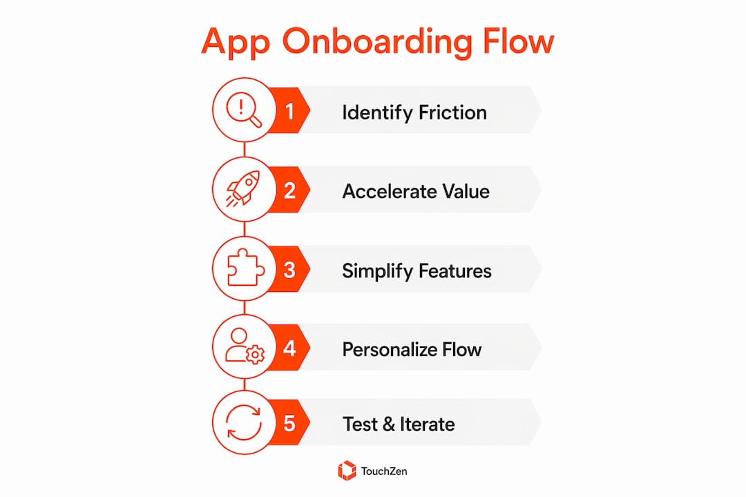
Accelerate the "aha moment"
Use cohort analysis to identify the specific action most strongly correlated with long-term retention in your product. Then redesign your entire onboarding flow around getting every new user to that action within their first session. Remove, defer, or compress everything that doesn't directly contribute to reaching that milestone.
Apply progressive disclosure
Show users only what they need to take the next step. Introduce advanced features only after users have completed a core action. This isn't about hiding functionality; it's about sequencing it so users build confidence before complexity arrives.
Limit each onboarding screen to one primary action.
Reveal secondary features contextually, triggered by user behavior rather than a fixed schedule.
Use checklists to give users a sense of progress and control.
Design empty states that guide rather than confuse
Transform blank dashboards into starting points. A well-designed empty state explains what will appear there, shows an example of the populated state, and presents a single clear call to action. Pre-filling a sample workspace or generating a first artifact using AI removes the paralysis of a blank screen entirely.
Reduce friction on the critical path
Delayed registration raises onboarding completion by 23%. Let users explore core functionality before asking them to create an account. Apply the same logic to every other friction point:
Use single sign-on to reduce form fields.
Request permissions in context, not upfront.
Mark optional fields clearly.
Add progress indicators so users know how much is left.
Personalize based on user intent
Add a short intent-capture step within the first 2–3 screens. Three to five questions about goals, experience level, or use case give you enough data to branch the flow meaningfully. Users get an experience that feels built for them; you get the data to make every subsequent touchpoint more relevant.
Pro Tip: Ask one high-impact question rather than a full survey. "What are you mainly here to do?" with three or four options is enough to route users into meaningfully different onboarding paths without adding friction.
Use multi-channel, multi-touch support
Onboarding doesn't end when the user closes the app. Behavior-triggered emails, push notifications, and in-app messages extend the onboarding experience across channels. The key is orchestrating these touchpoints from a single workflow so users don't receive the same nudge four times across four separate systems. Activation reminders should fire only when a user has stalled, not on a fixed schedule regardless of behavior.
Measure, test, and iterate
Track activation rate as your primary onboarding metric, not completion rate. A flow that users finish without reaching first value is optimized for the wrong milestone. Layer in step-level drop-off data and session recordings to understand not just where users leave, but why. Then run structured A/B tests on the highest drop-off steps, measure the impact on downstream retention, and move to the next problem. Tools like Mixpanel or Firebase Analytics give you funnel visibility to make these decisions with data rather than assumptions.
What experts say about onboarding mistakes and outcome-focused design
The most consistent expert critique of onboarding in 2026 is that teams measure the wrong thing. Completion rates and checklist progress are easy to track, but neither tells you whether users got value from the product.
"Most onboarding fails because of how we measure it, not how we design it. We track tour completion, checklist completion, time on each step. Those numbers are easy to log, and they all look like progress. But none of them tells you whether the user got value from the product. Instead, you should go for an outcome metric, the action that signals product value, not the action that finishes the welcome screen, and the design problems become easier to see." — Why Most In-App Onboarding Fails
This reframing changes the design question entirely. Instead of asking "how do I teach users where to click?", the right question is "how do I get users to the outcome they came for, with the least possible effort on their part?"
Several expert-backed principles follow from this shift:
Teach outcomes, not interfaces. A walkthrough that explains menu locations is teaching navigation. Users came to solve a problem. Every tooltip should explain why a user would want to take an action, not how the click works.
One question beats ten. Adding a single intent-capture question at signup, something like "What are you mainly here to do?", lets you route users into meaningfully different flows without adding friction. Personalization via intent-based questions consistently outperforms generic flows on activation.
Use AI to do the setup work. The pattern that's gaining traction in 2026 is using AI to complete a user's first task for them rather than teaching them how to do it. The user's job becomes evaluating the output, not constructing it from scratch. This approach, combined with deferred deep linking that delivers context-rich entry points from the first install, removes the generic welcome screen problem entirely.
Pick one activation milestone and design everything around it. Not "completed the welcome flow." One concrete event that predicts whether the user comes back next week and converts next month. Then cut everything in onboarding that doesn't measurably move users toward that event.
What onboarding actually is and why it determines everything downstream
App onboarding is the process that takes a new user from their first install to their first meaningful success with your product. It's not a tutorial, a feature tour, or a welcome screen. It's the bridge between the problem that made someone download your app and the moment they understand your app can solve it.
The reason onboarding determines so much of what follows is structural. Activation rate, the percentage of users who reach first value, is the single strongest predictor of retention and lifetime value. Users who don't activate during onboarding rarely convert to paid plans, rarely refer others, and rarely return after churning. A poor onboarding experience sets a ceiling on every downstream metric: trial-to-paid conversion, engagement, and revenue.
According to the Nielsen Norman Group, onboarding represents the highest-risk interaction point in the entire user lifecycle. A poorly designed initial experience creates accumulated friction that compounds with each subsequent interaction. Getting onboarding right isn't just about day-one retention. It's about whether your product ever gets a fair chance to prove its value.
How to collect user feedback during onboarding to find the real pain points
Funnel data tells you where users drop off. Feedback tells you why. Both are necessary, and most teams underinvest in the second one.
The most direct method is a short exit survey triggered when a user abandons the onboarding flow. A single question, "What stopped you from completing setup?", with four or five predefined options and a free-text field, surfaces patterns quickly without requiring a large sample. Combine this with session recordings from tools like FullStory or Hotjar to watch exactly what users do at high drop-off steps. You'll often find the cause within the first few recordings.
In-flow micro-surveys placed at specific steps, rather than at the end, give you step-level signal. A one-question prompt after a high-friction step, such as a permission request or a form, tells you whether users found that step confusing, annoying, or reasonable. Post-onboarding NPS surveys sent 24–48 hours after activation capture sentiment while the experience is still fresh.
User interviews remain the highest-signal feedback method for understanding the "why" behind behavioral data. Five to ten interviews with users who dropped off at the same step will reveal nuances that no survey can capture. The goal isn't statistical significance; it's understanding the mental model users brought to that moment and where your design failed to meet it.
Pro Tip: Segment your feedback by acquisition channel. Users who found your app through paid search often have different expectations than those who came through word of mouth, and their feedback will reflect that. Mixing them together can obscure the real cause of drop-off.
Segmentation strategies that make onboarding feel personal at scale
Generic onboarding is a symptom of building for an average user who doesn't exist. Segmentation is how you build for the users you actually have.
The most practical segmentation approach starts with intent capture at the beginning of the flow. A short preference screen, three to five questions about goals, experience level, or use case, gives you enough signal to branch users into meaningfully different paths. Each path shows different templates, different default settings, and different first actions. The user experiences an onboarding flow that feels built for their situation, because it was.
Acquisition channel is an underused segmentation variable. A user who came from a paid ad targeting "project management for remote teams" has a different context than one who came from an organic search for "task tracking app." Deferred deep linking lets you carry that context from the ad or search result into the app's first screen, skipping the generic welcome and delivering a preconfigured entry point that matches what the user was looking for.
Role-based segmentation matters most in B2B and productivity apps, where an admin setting up a team workspace and an end user joining an existing one need completely different first sessions. Routing them into the same flow is a reliable way to frustrate both. Separate paths, even if they share some screens, dramatically reduce the cognitive translation work each user has to do.
For improving app user retention across segments, the key metric to track is activation rate by cohort, not overall. A flow that works well for power users but fails beginners will look acceptable in aggregate while quietly losing your highest-growth segment.
How onboarding connects to your broader retention and lifecycle strategy
Onboarding doesn't end when users complete the welcome flow. It's the first stage of a longer lifecycle, and treating it as a standalone event is one of the most common structural mistakes in product development.
The activation milestone you define for onboarding should connect directly to the engagement behaviors you want to reinforce in weeks two and three. If your onboarding gets users to create their first project, your day-two email should reference that project specifically, not send a generic "10 features you haven't tried" blast. Behavior-triggered messaging that responds to what users actually did, rather than what day it is, keeps the onboarding momentum alive after the initial session.
Re-onboarding is a retention lever that most teams ignore. Users who activated but then went dormant often need a different kind of onboarding, one that reconnects them to the value they experienced initially and shows them what's changed since they last logged in. A targeted re-engagement flow for lapsed users, built around their original activation milestone, consistently outperforms generic win-back campaigns.
The first-run flow patterns that drive day-7 retention share a common structure: they get users to a meaningful action quickly, they personalize the experience based on that action, and they extend the onboarding conversation across channels in a coordinated way. The teams that build this kind of lifecycle integration from the start see compounding retention gains that teams optimizing onboarding in isolation rarely achieve.
For a broader view of how user experience improvements connect to retention across the full product lifecycle, the same principles apply: reduce friction, deliver value early, and personalize based on what you know about each user's goals.
Key Takeaways
App onboarding abandonment is driven by friction, delayed value, and generic flows; fixing it requires delivering the "aha moment" fast, personalizing by intent, and measuring activation rather than completion.
Point | Details |
|---|---|
First-week abandonment | 75% of users abandon the app within the first week. Poor onboarding can contribute directly to this early drop-off. |
2-minute abandonment threshold | Longer onboarding duration increases abandonment significantly; target 30–90 seconds for initial setup. |
Personalization lifts activation | Personalized onboarding improves activation by 30–50%; one intent-capture question is often enough to branch flows meaningfully. |
Measure activation, not completion | Track the action that predicts retention, not whether users finished the welcome flow. |
Delayed registration works | Allowing users to explore before signing up raises onboarding completion by 23%. |
Your onboarding is either building retention or destroying it
If your onboarding isn't getting users to first value within their first session, it's working against you. The data is consistent: users who don't activate early don't come back, and no amount of re-engagement spend recovers what a poor first experience costs you.
The product managers and developers who fix this fastest share one habit: they treat onboarding as a continuous experiment rather than a shipped feature. They define a clear activation milestone, instrument every step of the funnel, watch session recordings of users who drop off, and run structured tests on the highest-friction points. They don't redesign the whole flow at once. They fix the worst step, measure the impact, and move to the next one.
TouchZen has shipped 75+ apps across industries, generating 20M+ downloads and earning 12+ features from Apple and Google. If your onboarding flow is leaking users you've already paid to acquire, TouchZen's mobile app development team can help you diagnose the drop-off, redesign the critical path, and build the measurement infrastructure to keep improving it. Talk to a senior developer directly, no handoffs to junior staff, and get a clear plan for turning your onboarding into a retention engine.


