
Joy Foroughi
Executive Assistant


Paywall Design Patterns: A/B-Tested Templates That Lift Mobile App Revenue
Mobile app paywall design patterns and A/B test ideas that lift subscription conversion. A practical guide for founders, product owners, and growth teams. The paywall is the single most important screen in a subscription app. Most teams underbuild it. Here are the mobile app paywall design patterns that consistently lift conversion, and what to A/B test once the foundation is in place.

Introduction
For most subscription apps, there is one screen that decides whether the business works. It is not the home screen. It is not the onboarding. It is the paywall. For many subscription apps, a major share of revenue flows through it, and the difference between an average paywall and an excellent one can shift annual revenue by a meaningful margin.
That makes it strange how often the paywall is the least invested screen in the entire product. Teams spend months on onboarding, weeks on the brand, and a sprint on the paywall. Then they wonder why conversion is flat.
This guide is not about whether to monetize a mobile app. It is about how the paywall itself is built. We will walk through the most effective mobile app paywall design patterns we see across categories, what is worth A/B testing, the mistakes that quietly cap revenue, and a simple way to decide which pattern fits which app. The goal is practical: by the end, a founder should know exactly what to change on their paywall and why.
TouchZen Media mobile app development page
What a Mobile App Paywall Is, and Why Design Matters
A paywall is the screen where a user is asked to subscribe, start a trial, or unlock premium features. In a subscription business, it is the conversion event the entire product funnels toward.
Three things separate a paywall that converts from one that doesn't:
Clarity. The user understands what they get and what it costs within a few seconds.
Relevance. The benefits and timing match where the user is in their journey.
Trust. The pricing, terms, and design all feel honest. Nothing reads like a trick.
Paywalls that miss any of these tend to convert poorly, regardless of brand strength or feature set. The good news is that all three are design problems, which means they are fixable.
TouchZen Media UI/UX design page
Mobile App Paywall Design Patterns That Lift Conversion
Some patterns have proven themselves across categories. Most apps benefit from combining two or three of them rather than picking just one.
1. Value-First Paywalls
Lead with the outcome the user is buying, not the feature list. A fitness app shows a paywall headlined "Reach your goal weight in 12 weeks." A finance app shows "Hit your savings target six months sooner." Features come below, in service of the outcome.
This is often one of the most reliable directions to test because users buy results, not feature counts.
2. Free Trial Paywalls
A seven-day or fourteen-day free trial significantly lifts top-of-funnel conversion in most categories. The mechanics matter, though. Clearly state the trial length, the date the user will be charged, and the renewal price. Hidden trial terms are one of the fastest ways to attract refund requests and Apple guideline rejections.
A simple but powerful variant: a three-day trial that converts almost immediately. Common in fitness, language learning, and productivity apps where intent is high right after signup.
3. Feature Comparison Paywalls
A side-by-side table of "Free" vs "Premium" works especially well for apps where the differentiation is concrete: more workouts, more recipes, no ads, offline access, advanced analytics. Avoid using this pattern when premium is mostly intangible, like "better experience." Vague differences read as filler.
4. Social Proof and Testimonial Paywalls
A short user testimonial, a star rating, or a count of users who have hit their goal can do real work on a paywall. The best implementations are short and specific. "Joined by 240,000 runners" lands harder than "Loved worldwide." If the app has been featured by Apple or Google, that line belongs on the paywall.
[Internal link suggestion: link "Apple and Google featured apps" or "TouchZen portfolio" to the portfolio / projects page]
5. Personalized Paywalls
After a short onboarding quiz, the paywall can speak directly to what the user just told the app. A user who selected "lose weight" sees a paywall about weight goals. A user who selected "save for a home" sees a paywall about reaching that target. The headline, hero image, and benefit copy all shift.
Personalized paywalls consistently outperform static ones because the user feels seen, not sold to.
6. Usage-Triggered Paywalls
Instead of showing the paywall on first launch, the app waits for a moment when the user has experienced clear value. After the first workout. After saving the first item. After completing the first lesson. The paywall arrives when intent is at its peak.
The tradeoff: you lose some top-of-funnel conversion. The gain: the users who do convert tend to retain longer.
7. Annual Plan Anchor Pricing
Show the annual plan first, with the monthly price beside it for comparison. Position the annual price as the value choice ("Save 60%"). Many apps see annual mix climb significantly after this single change, which dramatically improves LTV and reduces churn risk.
Be careful not to manipulate the user. The discount should be real and clearly explained.
8. Post-Onboarding Paywalls
Most modern subscription apps place the paywall at the end of onboarding, after the user has answered a quiz, set a goal, or seen a preview of what is possible. This pattern frames the subscription as the natural next step rather than an interruption.
Done well, the onboarding teaches the user what the app does and earns the moment to ask for payment. Done poorly, it feels like a long ad before the user can use the product.
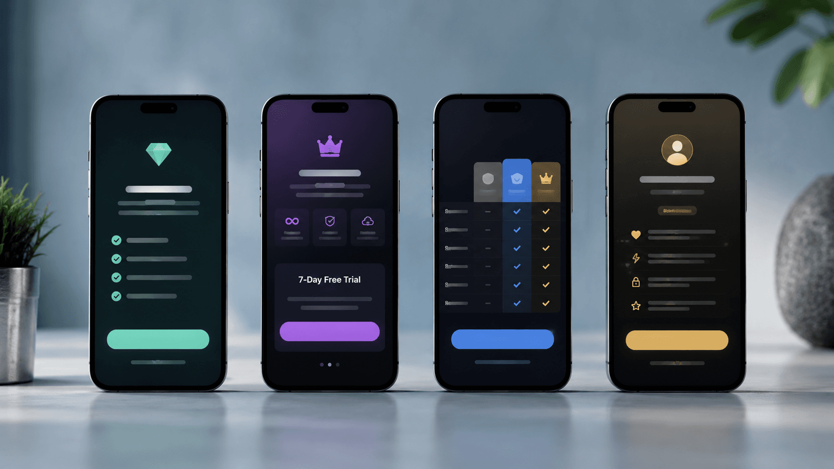
What to A/B Test on a Paywall
Once a paywall has a stable foundation, the highest-leverage A/B tests are usually on the same handful of elements:
Headline. Outcome-based versus feature-based. Specific number versus general benefit.
Pricing display. Monthly cost shown as a small daily figure ("$0.27/day") versus the actual monthly figure.
Plan emphasis. Annual highlighted versus monthly highlighted. Default selection matters more than founders expect.
Trial length. Three days versus seven days versus fourteen days. Shorter trials often convert faster; longer trials sometimes retain better.
CTA copy. "Start Free Trial" versus "Continue" versus "Unlock Premium." Each carries different psychological weight.
Benefit order. The first benefit on the list earns the most attention. Test which benefit deserves that spot.
Timing and placement. Paywall on first launch versus after onboarding versus after a usage milestone.
Visual hierarchy. Hero image, illustration, or pure typography. Each works in different categories.
A practical rule: test one element at a time, ship the winner, and move on. Multivariate tests look thorough on paper and almost always produce noisy results in real apps.
Common Mistakes Founders Make With Paywalls
Patterns we see again and again:
Burying the price. Users distrust paywalls where pricing is hard to find. Make it obvious.
Too many plans. Three is the usable maximum on most paywalls. Five plans almost always reduces conversion.
Generic copy. "Upgrade to Premium" tells the user nothing about what they are buying.
Misleading trial terms. Apple and Google both reject paywalls where the trial length, renewal date, or price is hidden.
No social proof. A paywall without trust signals leaves real conversion on the table.
Shipping it once and forgetting it. A paywall that has not been tested in six months is almost certainly underperforming.
Treating the paywall as a design task only. It is a conversion screen. Engineering, design, copywriting, and growth all need a voice in it.
A Simple Decision Framework
Different apps benefit from different combinations. A starting point:
Habit and goal-driven apps (fitness, finance, learning, health) usually win with value-first headlines, personalized paywalls, and a free trial.
Content-heavy apps (news, video, audio) tend to win with feature comparison paywalls and annual plan anchor pricing.
Marketplace and utility apps often do best with usage-triggered paywalls placed after a user has hit a clear value moment.
Premium professional tools (creative, productivity, business) usually benefit from feature comparison plus annual emphasis, since the buyer is comparing options carefully.
Social and entertainment apps lean toward post-onboarding paywalls with strong social proof.
A useful starting question: what does the user need to believe before they will pay? Build the paywall around that belief.
How TouchZen Media Approaches Paywall Design
Paywall design sits at the intersection of UX, copywriting, growth strategy, and engineering. Done well, it lifts revenue without feeling pushy. Done poorly, it caps a business that should be growing faster than it is.
At TouchZen Media, we have shipped 75+ mobile apps across iOS and Android, with 20M+ combined downloads and 12+ features from Apple and Google. Paywalls and subscription flows are part of how we think about mobile app design from the first sprint, not as a bolt-on at the end. The teams that earn the strongest revenue numbers usually invest in the paywall the same way they invest in the home screen: intentionally, iteratively, and backed by real testing.
If you are launching a new app or trying to improve revenue on an existing one, contact TouchZen Media and we'd be glad to walk through what your paywall could look like.
https://www.touchzen.ai/contact
Conclusion
Mobile app paywall design is one of the highest-leverage areas of monetization work a founder can invest in. The screen is small, the variables are knowable, and the impact compounds. Apps that treat the paywall as a serious product surface consistently outperform apps that treat it as a checkbox at the end of onboarding.
Start with one strong pattern, ship it cleanly, and test the handful of variables that matter most. Most teams find that paywall improvements are the single most efficient revenue work they can do in any given quarter.
Frequently Asked Questions
1. What is a mobile app paywall?
A mobile app paywall is the screen where a user is asked to subscribe, start a free trial, or unlock premium features. It is the primary revenue conversion screen in subscription and freemium apps, and small design changes can produce large shifts in conversion.
2. When should an app show a paywall?
The best timing depends on the category. Habit-driven apps usually win with a paywall right after a short onboarding quiz, while marketplace and utility apps often perform better with a usage-triggered paywall that appears after the user has experienced clear value. The right answer is almost always tested, not guessed.
3. What should be A/B tested on a mobile app paywall?
Headline, pricing display, default plan selection, trial length, CTA copy, benefit order, paywall timing, and visual hierarchy are the eight elements with the most consistent impact. Test one element at a time and ship the winner before moving on.
4. Is a free trial better than a discount?
For most consumer apps with clear ongoing value, free trials outperform one-time discounts because they give the user time to build a habit. For apps with a single moment of value (a one-off tool, a piece of content), discounts often work better. The right call depends on whether retention is the goal.
5. How can better paywall design improve app revenue?
A well-designed paywall lifts conversion at the top of the funnel, increases annual plan adoption, reduces refund and chargeback rates, and improves long-term LTV. Across categories, paywall optimization is one of the highest-ROI changes a mobile app team can make.